Data Studio: Richer Visualizations and Analytical Functions
The Data Studio team has been hard at work launching new features to allow for richer visualization and new views on data. Today, we'll highlight some of these recent launches.
Pivot Tables
Pivot tables let users narrow down a large data set or analyze relationships between data points. Additionally, they reorganize user's dimensions and metrics to help quickly summarize data and see relationships that might otherwise be hard to spot.
Example Pivot Table (Help center doc here)
Coordinated Coloring
Coordinated coloring allows users to bind colors to specific data. When a user creates visualizations, Data Studio automatically binds colors to data, so that color:data pairs stay consistent between visualizations and when filtering. This feature is automatically turned on for all new reports, and available in old reports.
Example Coordinated Coloring (Help center doc here)
Google Analytics Sampling Indicator
Google Analytics samples data in order to provide accurate reporting in a timely manner. Data Studio now shows a sampling indicator in Data Studio reports when a component contains sampled Analytics data.
GA Sampling indicator (Help center doc here)

Field Reports Editing
Data Studio has also recently added new options to the chips in reporting. These new options allow you to:
- Rename fields
- Change aggregation types
- Change semantic types
- Change date functions
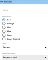
- Apply % of total, difference from total, or percent difference from total to a metric from within the report.
Example of new field editing options (Help center doc here).
Submitting and voting for new features
The Data Studio team will continue to introduce new features and product enhancements based on your submissions. You can view requests submitted by other users, upvote your favorites, or create new ones. Learn more here.

