New reach and frequency metrics in Display & Video 360


Earlier this week, we announced new ways to help you easily capture connected TV and audio streamers' attention and understand what drives them to become customers.
To deliver a consistent user experience across these new channels and more established ones, it’s critical to control the overall number of times people see your ads.
Effective cross-channel frequency management can also reduce budget waste and help you make every ad dollar count. On average, we found that customers see a 6% reach gain when managing frequency in Display & Video 360.
But beyond averages, we heard that you needed a personalized assessment of the impact of cross-channel frequency management solutions on a campaign-by-campaign basis. We’re introducing two new tools that help you appraise the benefits of your own cross-channel frequency management strategy on an ongoing basis and at no cost.
Quantify the reach impact of cross-channel frequency management
First, we’re adding a dedicated data visualization for each campaign that spans across channels and has a frequency goal set at the campaign level. The visualization shows how much reach was gained due to effective frequency management at the campaign level. You can also access the same information at the advertiser or at partner level by creating an offline report in the standard Display & Video 360 reporting.
Frequency management data visualization
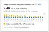
Having a real-time view of reach gains gives you more precision in evaluating your campaign performance. It also lets you assess the value of managing your programmatic campaigns across channels in a consolidated way. This leaves you better armed to defend marketing budgets.
With this new data visualization, you don’t need to set up an experiment with a test and control phase in order to see the impact of applying your frequency management strategy across media types. Display & Video 360 uses log data to automatically compare the reach obtained by a cross-channel campaign against the reach that you would have obtained with separate campaigns, each containing a single channel and its own frequency goal.
Measure the extra reach coming from Programmatic Guaranteed strategies
Display & Video 360 will now calculate for you the extra reach you get for each Programmatic Guaranteed deal using Display & Video 360's frequency management solutions. This new metric will help you get a better understanding of how Programmatic Guaranteed deals contribute to the incremental reach you get from applying frequency management across media.
This topline data point will be visible in a dashboard in the “My Inventory” tab. You’ll still be able to use Display & Video 360’s offline report to see budget savings reinvested and impressions passed due to frequency for each Programmatic Guaranteed deal.
Managing frequency without third-party cookies
We’re committed to building solutions that will let you maintain control over ad exposure in a way that respects user privacy even when third-party cookies and identifiers are missing. Since 2019, Display & Video 360’s cross-domain frequency management tools have been powered by machine learning technology. And recently, we’ve further evolved these models to enable advertisers to manage frequency on Firefox ETP and Microsoft Edge traffic. In the future, we’ll keep exploring innovative ways to protect users’ privacy while controlling users’ overexposure to ads and limiting media waste.