Newsmakers: Storytelling through numbers with Alberto Cairo
Editor’s note: We’re celebrating innovation in journalism through a series of interviews with changemakers from across the news industry. Through the “Newsmakers” series, you’ll get to know a few of the journalists, newsroom leaders, researchers and technologists who are shaping the future of news.
When a major news event takes place, we’re all familiar with reading written stories. But sometimes journalism goes beyond the written word, conveying information visually. Beyond photographs, data visualizations are an emerging field where journalists take large sets of data—think the US census or statistics around Android users around the world—and turn that information into charts, graphs and maps.
Alberto Cairo has spent his career making data more accessible, and visually interesting, too. The University of Miami professor is also an author and a freelance visualization designer. His new book, How Charts Lie: Getting Smarter about Visual Information, will be published this fall. Alberto is collaborating with Google to showcase Trends data on projects like the lifespan of a news story and tutorials for emerging data journalists, plus the ever-important questions around the habits of cats and dogs.
This week, Alberto shares his thoughts on the skills that are necessary to tell visual stories with data and the evolution of this emerging field in journalism.

How did you get started working in data journalism?
I began by happenstance. I studied journalism and visual design, but my original goal was to become a radio journalist. I even interned at the local branch of my national public radio station in A Coruña, Spain, where I was born.
In the last year of getting my journalism degree at Universidad de Santiago de Compostela, one of my professors, Marita Otero, recommended me for an internship in the graphics department of my hometown newspaper, La Voz de Galicia. Professor Otero knew that I could sketch stuff out and think visually. I've always used diagrams and illustrations to communicate complex concepts or to help myself remember things. I fell in love with information graphics thanks to the team at La Voz de Galicia, and I have been in this business ever since.
Break this down for the non-experts. How do you approach a new collection of data full that’s of unfamiliar facts and statistics?
To deal with data you need to have subject matter expertise, which is something that we journalists lack. My recommendation is to always try to partner up with people who know more than you do about the data, because they will help you interpret it, avoid mistakes, and answer questions like where the data came from and what it’s measuring. I’ve made too many mistakes myself for not following my own advice.
The expertise that I can provide is not around the data itself, but about how to represent it graphically. I don't consider myself a data journalist in the sense of someone who analyzes data, but I can design visual representations of numbers in collaboration with scientists or statisticians.
Morph is a free and open-source tool for creating designs, animations or interactive visualization through data
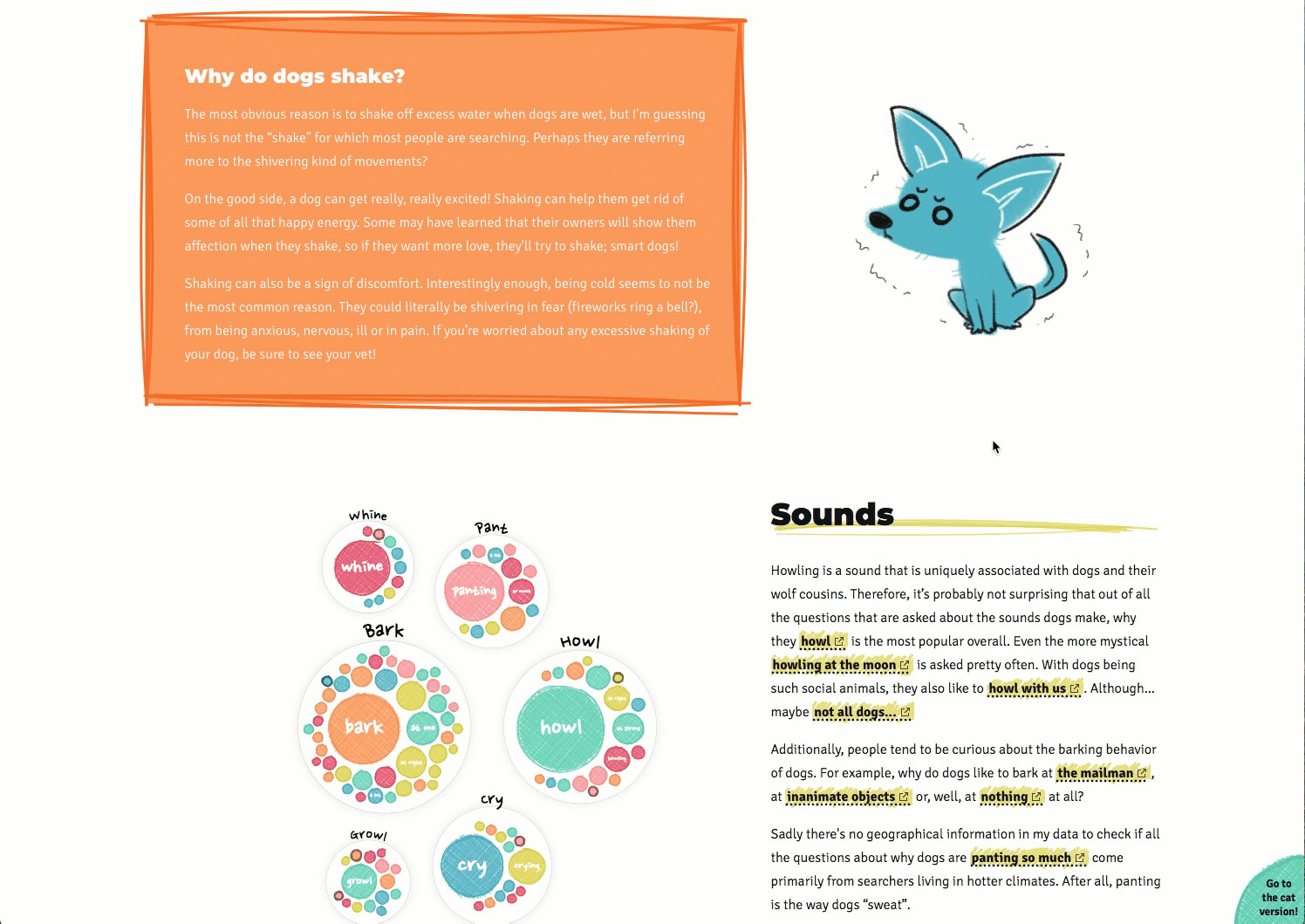
This data visualization uses Google Trends data to show the top searches around why cats and dogs act the way they do.
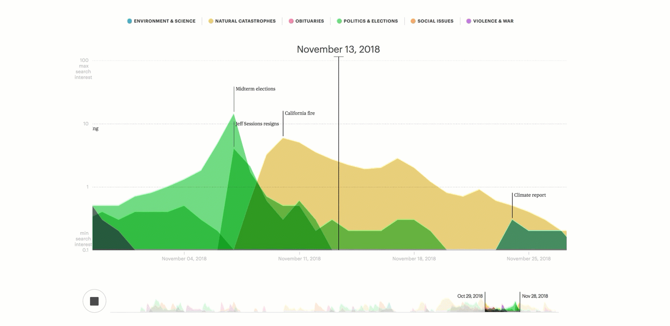
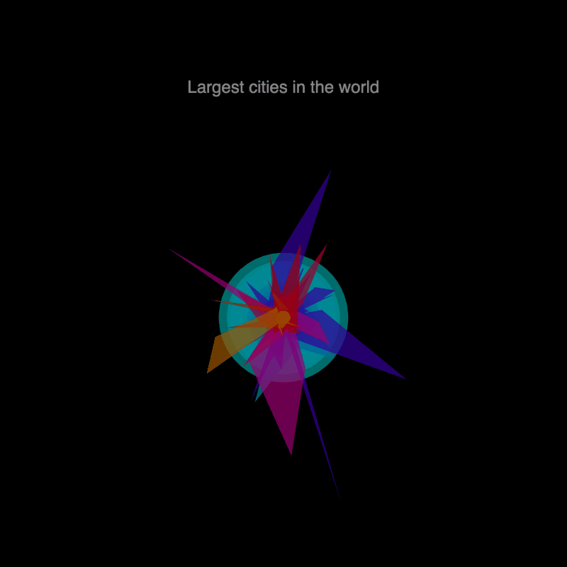
The Lifespan of News Stories data visualization demonstrates how different news stories hold the public’s attention.
How has technology enabled you to tell stories in new and innovative ways?
I began my career more than 20 years ago when visualization software tools weren’t nearly as advanced as they are today. Nowadays, there is a huge variety of powerful and often free or open-source tools to design data visualizations. Point and click software solutions like Flourish have lowered the barrier to entering visualization, making it possible for anyone to get started in our field.
Pairing the existence of plentiful, easy to learn tools with a strong understanding of best practices in presenting data is the key for the future of data visualization.
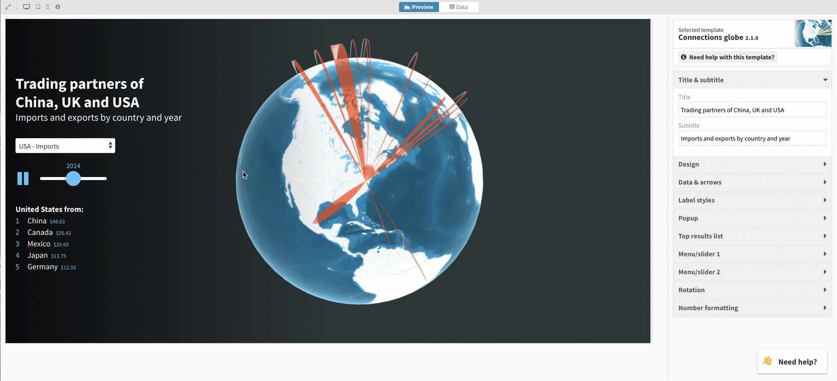
A template in Flourish, a data visualization program.
What do you think the future of your job and you industry will look like?
There are many emerging trends that may signal where visualizations are going.
Some of the techniques are coming from other fields. Building off approaches from traditional film documentaries, I expect to see a rise in narrative visualizations that have additional layers, like voiceovers, to help explain data. We are also borrowing from the world of video games. Graphics that let you create alternative scenarios, see different explanations of the same phenomena, or compare yourself to other people are becoming popular because they increase understanding and engagement.
Data visualizations as we think of them today may not be the limit. Data is currently being printed into 3D space to create physical representations, and data sonification has been around for a while. We recently launched TwoTone, a browser-based tool to sonify data, created by Datavized in collaboration with the Google News initiative. Presenting data beyond sight through other senses—hearing, smell, taste, or touch—gets me really excited. These techniques may increase accessibility.