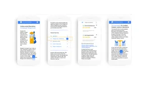
Boost your multi-screen strategy with AdSense Responsive ads
Today we’re happy to share some product updates to complement and strengthen your strategy, with new features for our responsive ad units and a multi-screen optimization score now available.
The new full width ads on mobile devices
Our experiments show that full-width responsive ads perform better on mobile devices in portrait mode. Previously Responsive ads fitted to standard sizes. The new launch will now automatically expand ads to the full-width of the user's screen when their device is orientated vertically.

Best practices to help improve your mobile performance
We are also happy to share with you other best practices to help improve your mobile performance. Check out this video get tips on how to create an excellent mobile experience for your users and potentially increase your mobile revenue. Let’s get started!More information on Responsive ad units can be found in our Help Center.
We look forward to hearing your thoughts on these new features.

