A pop of color and more: updates to Android’s brand

Over the last decade, Android's open platform has created a thriving community of manufacturers and developers that reach a global audience with their devices and apps. This has expanded beyond phones to tablets, cars, watches, TVs and more—with more than 2.5 billion active devices around the world. As we continue to build Android for everyone in the community, our brand should be as inclusive and accessible as possible—and we think we can do better in a few ways.
Android Q is Android 10

First, we’re changing the way we name our releases. Our engineering team has always used internal code names for each version, based off of tasty treats, or desserts, in alphabetical order. This naming tradition has become a fun part of the release each year externally, too. But we’ve heard feedback over the years that the names weren’t always understood by everyone in the global community.
For example, L and R are not distinguishable when spoken in some languages. So when some people heard us say Android Lollipop out loud, it wasn’t intuitively clear that it referred to the version after KitKat. It’s even harder for new Android users, who are unfamiliar with the naming convention, to understand if their phone is running the latest version. We also know that pies are not a dessert in some places, and that marshmallows, while delicious, are not a popular treat in many parts of the world.
As a global operating system, it’s important that these names are clear and relatable for everyone in the world. So, this next release of Android will simply use the version number and be called Android 10. We think this change helps make release names simpler and more intuitive for our global community. And while there were many tempting “Q” desserts out there, we think that at version 10 and 2.5 billion active devices, it was time to make this change.
A refreshed look for the brand
The Android brand has evolved over time. Back in 2014, we updated our logo and brand color, and this year, we’re introducing a more modern, accessible look.

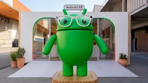
The design of the logo draws inspiration from the most recognizable non-human member of the community, the Android robot. The robot belongs to everyone in the community, and has long been a symbol of the fun and curiosity at the heart of Android. Now, it has a special place in our logo.
We also changed the logo from green to black. It’s a small change, but we found the green was hard to read, especially for people with visual impairments. The logo is often paired with colors that can make it hard to see—so we came up with a new set of color combinations that improve contrast.
We’ll officially start using the updated logo in the coming weeks with the final release of Android 10. Thank you to the community for supporting Android and inspiring us over the years.


