Buzz, click, tap: Designing how haptics and devices feel
I’ll never forget my first cellphone. I got it when I was 13, and it was the definition of “basic,” but I remember it so well — namely, how it felt. I remember the feel of the buzzy vibration of notifications, the rubbery keypad and the padded click of the power and volume buttons.
How devices feel affects how people feel; it’s just as important in creating the user experience as color, size and shape — and it takes teams of experts who rely on research, technological advancements and years of study to make sure products feel right.
Haptic design past and present
Early phones like the one I’m talking about are mostly a memory, but device “feel” certainly is not. Haptics is about the feel of things, whether mechanical or virtual, when you interact with them. Engineering and designing how devices feel is an important part of the product definition and development process.
Back in the days of my first phone, mobile handsets came pre-set to buzz very audibly to get your attention, says Debanjan Mukherjee, lead sensor engineer and technologist at Google. “Most people paid less attention to the pleasantness, subtlety or rhythm of a vibration,” he explains. The smartphone revolution of the mid-aughts quickly changed that. “Developers started asking how software and hardware could be used together to notify users but also confirm an action or give a sense of confidence,” says Debanjan. Once people started heavily using touchscreens, this feedback needed to happen faster than previous hardware could keep up with. Because of this, haptic development has been evolving quickly both at large and at Google. And a lot has changed in a relatively short amount of time.
While people generally agree that higher frequency leads to “sharper” vibrations, user preference is often subjective. “In the old days, we gave a vibration around 200 to 300 Hertz because that’s where human skin is most sensitive,” says lead haptics scientist Hong Tan, who has spent most of her career studying how people respond to haptic feedback. “But I liken that frequency to a soprano voice — it’s very sharp, not everyone appreciates it.”

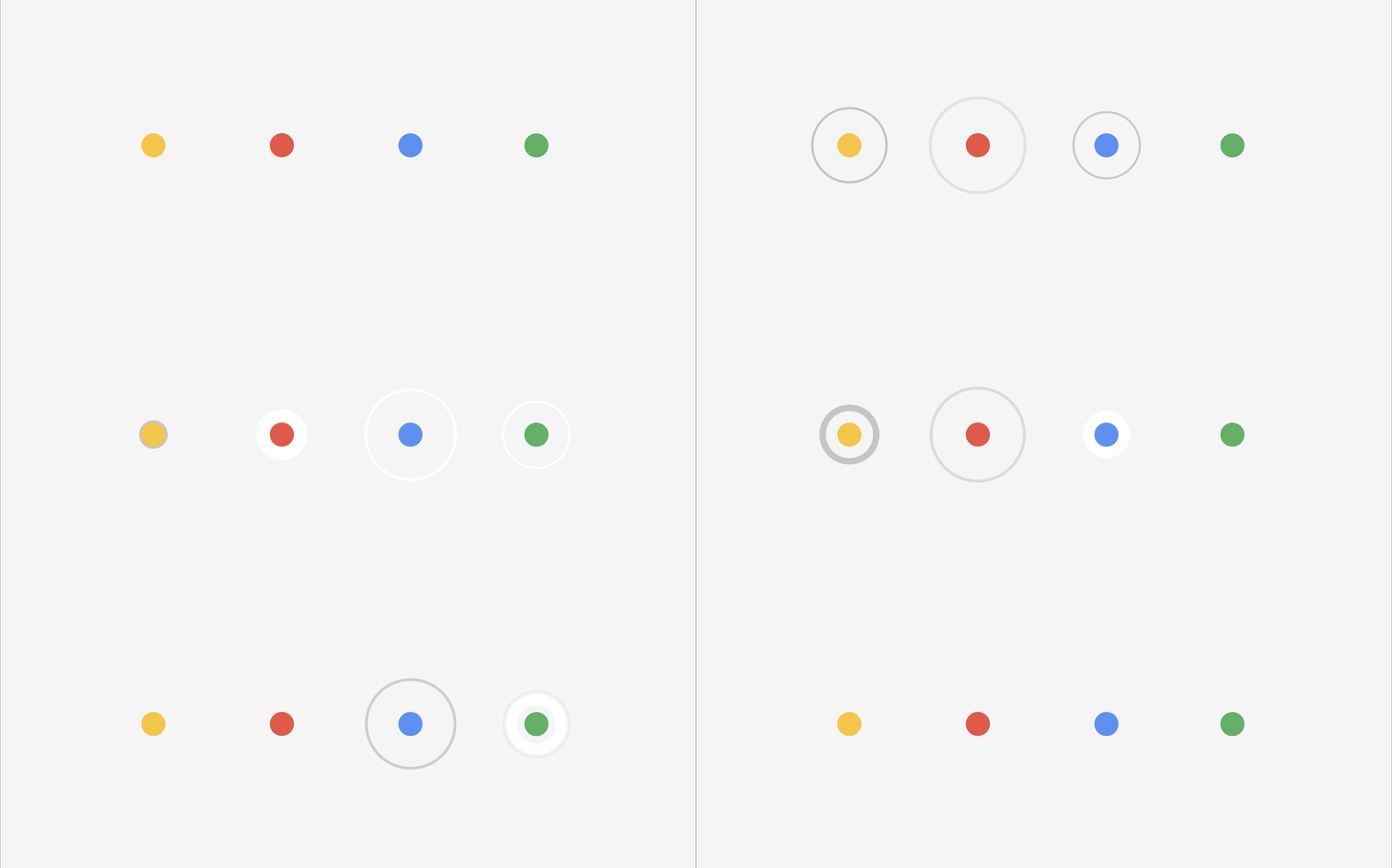
An animation of a Pixel tactile feedback action. The action on the touchscreen creates a haptic response, which is seen in the waveform below.

As focus on Pixel products grew, the team started experimenting with more organic-feeling frequencies, looking for some vibrations that, yes, felt sharp, but others that felt “round.” Some that were click-like and others that were gentle. “You can have many different flavors,” says Debanjan. And Pixel phones began optimizing hardware and software for tighter vibrations that created a snappier feel. The Pixel 6 eventually became the first smartphone that allowed users to adjust the frequency and feel of their phones’ haptic responses.
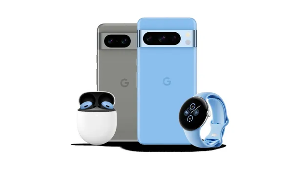
“Haptics accomplishes so much,” says Hong. “They alert, inform and delight!” Engineers and researchers have worked to make Pixel haptics more polished — and that includes the latest additions to the Pixel family, the Pixel 8 and Pixel 8 Pro. “These upgrades might seem marginal, but we want to keep refining what may seem like a ‘small’ experience because that’s what keeps moving the Pixel devices along,” Hong says.
Evolving the Pixel’s haptics requires a lot of playing around and testing. The engineering team has their own app where they can play with different variations of vibrations (Android developers can use it, too). In a demo, they showed me all the subtle differences. “You have the click, which is very short. And there’s the tick, which is a less intense version,” Hong says. “And then low tick, which feels softer. The first two are crisper, but this has a lower frequency; it’s more pleasant, more organic.” There are rows of vibration options with names like “thud” and “quick fall,” each producing a new feeling for users.
A feel-good testing process
Googlers developing device feel start by relying on their accumulated knowledge of touch. “Sometimes I feel like I’ve held every remote that’s available in America,” says Stefan Reichert, an industrial designer who helped develop the Chromecast remote, a particularly challenging project. “Everyone has their own favorite remote, and they’re all slightly different in size, weight, button layout and button tactility,” says Stefan.
Stefan says that years of experience give many industrial designers an instinct of what will work best, a good place to start experimenting. “You sort of know already what the equations are that you’ll need to use,” he says. And there are lots of equations. To get that satisfying click when you press the Chromecast remote’s buttons, for instance, Stefan and the team used diagrams to calculate the right balance between the user’s force and the button’s travel time.
“There’s a fine line,” says Stefan. “You don’t want a button to feel ‘mushy’ when you press it. If it feels like there’s no resistance, it feels cheap. But you don’t want there to be too much resistance, because that would be tiring.”
Designers worked to make sure the button-press on the Chromecast remote felt just right.

Once the team felt they'd found the right equation for the click, it was time to test and make sure they found the sweet spot between mushy and tiring. They tried prototype after prototype, looking not only for the right click but also with accessibility in mind. “We wanted to make sure this would work for people with dexterity issues, too,” Stefan says. This is part of why he thinks the remote’s top button, which in addition to being a different color also has a subtle dome-like shape that differs from the silicone buttons, was a great addition. “You can easily identify it even if you’re visually impaired,” he explains.
The team that developed the new Nest Doorbell also went through button-focused trials. They wanted the doorbell’s click to have a “premium tactility,” says industrial designer Rhea Jeong, who helped craft this click. It should have some weight behind it, she says, but not too much, and when it touches down, you should get a solid, snappy sensation.

To find that premium feel, the industrial design and engineering teams created 3D models of the doorbell with different click varieties which they mounted on free-standing front doors in their lab. They ultimately decided to use a mechanical button instead of a digital one, meaning there’s a collapsible structure inside the device doing the clicking versus a digital one that creates feedback. “There was more satisfaction with a mechanical button,” Rhea says.
Doorbell team members test the button.

The designers and engineers worked together to balance the other needs of the device, like that it had to be a specific size without negatively impacting the click. “It’s all about balance,” says Rhea. “There will be things you didn’t think would change the feel of the click, but then they do, and you have to go back and adjust.”
What’s next
The technology behind device feel is quickly getting better; smaller motors and sensors can fit into more products, for example. This gives designers more wiggle room and creative space to play with. Plus, more user research gives designers additional insight.
Looking forward, the haptics team wants to fine-tune their craft even more and bring it to additional actions on Pixel phones and beyond.
For every new product we make, industrial designers are there sharing their knowledge and finding balance with what engineers need to achieve. “There’s no golden recipe,” Rhea says. “We just want to make sure that every button we put out into the world is designed with care.”

