A Google designer takes us inside Search’s mobile redesign

The beginning of a new year inspires people everywhere to make changes. It's when many of us take stock of our lives, our careers or even just our surroundings and think about what improvements we can make. That's also been the case for Google designer Aileen Cheng. Aileen recently led a major visual redesign of the mobile Search experience, which rolls out in the coming days. “We wanted to take a step back to simplify a bit so people could find what they’re looking for faster and more easily,” she says. “I find it really refreshing. To me, it’s a breath of fresh air!”
Like all organizing efforts, this one came with its challenges. “Rethinking the visual design for something like Search is really complex,” Aileen says. “That’s especially true given how much Google Search has evolved. We’re not just organizing the web’s information, but all the world’s information,” Aileen says. “We started with organizing web pages, but now there’s so much diversity in the types of content and information we have to help make sense of.”
We recently had the chance to learn more about the new look from Aileen, as well as the process. Here are five things that drove the redesign:
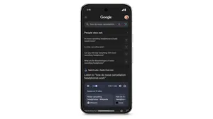
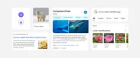
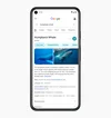
2. Making text easier to read. One way the team did this was by using larger, bolder text, so the human eye can scan and understand Search results faster. “We’re making the result and section titles bigger, as well,” Aileen says. While we’re on the subject of text: The update also includes more of Google’s own font, which already shows up in Android and Gmail, among other Google products. “Bringing consistency to when and how we use fonts in Search was important, too, which also helps people parse information more efficiently,” Aileen explains.
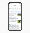
3. Creating more breathing room. “We decided to create a new edge-to-edge results design and to minimize the use of shadows, making it easier to immediately see what you’re looking for,” says Aileen. “The overall effect is that you have more visual space and breathing room for Search results and other content to take center stage.”
4. Using color to highlight what’s important. Aileen says that some other iterations of the redesign experimented with using lots of bold colors, and others tried more muted tones. They weren’t quite right, though, and ultimately the team focused on centering content and images against a clean background and using color more intentionally to guide the eye to important information without being overwhelming or distracting. “It has an optimistic feel, too,” Aileen says.
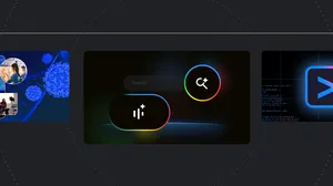
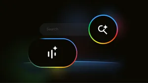
5. Leaning into that “Googley” feeling. If you’re noticing the new design feels a little bubblier and bouncier, you’re onto something. “If you look at the Google logo, you’ll notice there’s a lot of roundness to it, so we’re borrowing from that and bringing it to other places as well,” says Aileen. You’ll see that in parts of this redesign, like in rounded icons and imagery. “That form is already so much a part of our DNA. Just look at the Search bar, or the magnifying glass,” Aileen points out.
Part of the work is also in refreshing the look while remaining familiar. “My three-year-old recently dropped a handful of Legos in my hand, red, yellow, green, blue, and he told me, ‘Mama, this is Google,’” Aileen says. “That’s how playful and well known we are to people. And when we redesign something, we want to bring that familiarity and approachability with us, too.”