Creating map icons that reflect the culture and traditions of Indigenous Australians
Editor’s note: Today’s post is by Andrew Dowding, Managing Director of Winyama, a digital mapping company based in Perth, and Dennis Golding, Freelance Designer with Google’s Creative Lab. Dowding, a Ngarluma person from the West Pilbara, led last month’s Indigenous Mapping Workshop in Perth. At the workshop, Golding, a descendant of the Kamilaroi/Gamillaraay people from the North West of New South Wales, presented new mapping icon designs to help Aboriginal and Torres Strait Islander communities map cultural and natural resources. Below, Dowding and Golding explain the creative process behind the icons.
Humankind’s earliest maps, usually created by Indigenous peoples, were drawn by hand in sand or engraved onto rocks. In a sense, the drawings—many of which still exist today—were versions of today’s online map pins and icons, intended to guide people to important places and show our connection to the land.
As more Aboriginal and Torres Strait Islander Australians assert their traditional ties to their lands, they need modern-day replacements for sand and rock drawings. At the Indigenous Mapping Workshop, we helped Australia’s Indigenous peoples use mapping tools like Google Earth to visualise their lands and preserve cultural knowledge about their country for future generations.
Google Maps icons already do a great job of telling us where we can grab a coffee or find a place to stay. However, we want to share a different kind of knowledge with our communities: knowledge about where to find cultural sites and where specific animals often gather. We need to guide people to traditional foods, shelter, animals, and sacred spaces. When we’re explaining what life is like in our country, we need icons showing bush tomatoes or berries, and icons that represent people around campfires.
Icons with meaning for highly diverse Indigenous communities
With 100 Indigenous community members coming together in Perth, the Indigenous Mapping Workshop was the perfect place to present icon designs reflecting Aboriginal and Torres Strait Islander peoples’ cultures. Our plan was to bring 20 icon designs to the workshop, where we’d collaborate with community members on ideas for more icons, eventually ending up with a group of 50 icons that covered a range of Indigenous experiences, places, and practices. With these icons in hand, mapping workshop attendees can visualise their significant places and tell Indigenous stories using maps.
But before we created the icon concepts, we acknowledged our design challenges:
Australia’s Indigenous communities are not homogenous. In Australia alone, there are hundreds of Indigenous peoples and more than 250 Aboriginal language groups, each with their own artworks, cultures, and lifestyles. A sea turtle icon could mean something to a coastal person, but mean nothing at all to a desert person. We had to tap into a common universe of symbols so that, as much as possible, icon designs would resonate across cultural lines.
Map icons need to be small in scale. Mapping icons are meant to be clearly read on device screens. We had to reduce designs to their most basic elements, so they’d pop on a map and not melt into the landscape.
Our design style is different. We like the sharp-edged and computer-designed icon style used in Google Maps, but that style doesn’t match up with Aboriginal art, which relies on hand drawings and isn’t so clean-edged.
Grounding icons in traditional symbols
We’re lucky to have the support of Google’s Sydney-based Creative Lab team on this project. Creative Lab is a group of creators, developers, and filmmakers who explore Google tools and emerging technology; they designed the Indigenous Mapping Workshop’s logo. Dennis began working with the Creative Lab in 2018 as its first Aboriginal designer.
To start the design process, Andrew focused on the basic patterns and symbols of Aboriginal art as a visual language for the icons, and gave Dennis some designs from an Aboriginal art teaching website.
Dennis—who already has experience creating Indigenous-inspired designs with his rugby jersey for Australia’s Wallabies team—started his research on the street, looking at signs. He thought about how signs guide us when we’re walking and driving, and how icons and colours come together to take us from place to place.
He also researched objects that could be used as the basis for icons—like boomerangs, the traditional thrown tool used by Aboriginal and Torres Strait Islander peoples for hunting, and middens, buried collections of shells that indicate where Indigenous peoples ate meals.
Here’s one of the first mockups, done in Adobe Creative Suite. At this point, we didn’t have icons yet—just some drawings of Indigenous objects.

Dennis wanted the icon designs to be informed by Aboriginal art, but also to be read instantly by the viewer, using a simple and universal style for the entire icon set. We had to pull back a bit from the traditional designs we started with. The symbolism of the icon mattered above all: They had to communicate meaning while still reflecting the past.
Here’s how we simplified the drawings to emphasise the symbolism:
From traditional designs to icons:
Water holes Camp Turtle We also had to think about using color to classify icons—another way to help map-makers and map readers understand the icons and their purpose.
Our first set of icons, with more to come

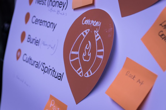
With our starter set of 20 icons, we were ready to throw this project open to discussion at the Indigenous Mapping Workshop, in hopes of refining the designs we have, understanding the needs of different communities and getting inspiration for more. We decided to add some new icons based on conversations with attendees—for example, icons for wind (which we did not expect!), icons that could mark sites of genocide or acts of brutality against Indigenous communities, and icons that could be gender-based to align with cultural protocols around men’s business and women’s business. There were also instances where people suggested new designs for existing icons like the Pearl Shell and Ceremony icons. We expect that the icon design process will continue for the rest of the year as we share refinements with workshop attendees and consider feedback from different Aboriginal communities.
Dennis Golding chatting with workshop participants about the icon project. Photo credit: Dion Kickett Photography

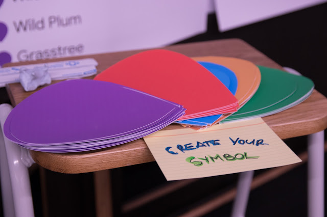
Workshop participants were invited to suggest new icons that would support their mapping projects. Photo credit: Dion Kickett Photography

IMW participants suggested ideas for ceremony and rock art icons. Photo credit: Dion Kickett Photography

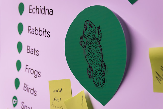
IMW participants suggested ideas for icons that represent significant animals. Photo credit: Dion Kickett Photography

We’re excited to have a set of mapping icons that reflect us and our Aboriginal traditions. Because Australia is so vast, people tend to think of Aboriginal lands as empty landscapes. But as our maps and icons will show, these are vibrant places filled with life and culture—and far from empty.


