How we redesigned the Chrome icon

After more than eight years, we introduced a refreshed version of the Chrome icon for the 100th update for Chrome earlier this year. Today, I chatted with user experience interaction designer Elvin Hu and visual designer Thomas Messenger to go behind the scenes and learn more about how the Chrome icon was designed.
What was the Chrome icon meant to represent originally?
Thomas: When we introduced Chrome back in 2008, our goal was to build a browser that was fast and easy to use, and nothing better represented speed than a rocket ship! But our team decided to move away from a literal rocket ship in the end, and came to a design that looked approachable and clickable that still captured the spirit of Google.
One of the first ideas for the Chrome icon
Why are you making this change now?
Elvin: The logo hadn't been updated in eight years, and we wanted to give it a refreshed and modern look to reflect how Chrome has evolved as a product. We also noticed that the visual design of modern operating systems was becoming more stylistically diverse, so it was important that the Chrome icon felt more adaptable, native and fresh no matter what device you used.
How will the Chrome icon look different across operating systems?
Elvin: We simplified the main brand icon by removing the shadows, refining the proportions and brightening the colors, to align with Google's current brand design. We also found that placing certain shades of green and red next to each other created an unpleasant “glow” between the two colors, so we introduced a very subtle gradient to the main icon to make the icon easier to the eyes compared to using flat colors. Then we created OS-specific customizations. We want the icons to feel recognizably Chrome, but also well crafted for each operating system.
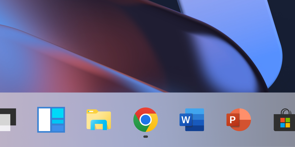
On Windows, the icons use a more obvious gradient, appearing at home on Windows 10 and 11. On ChromeOS, they use brighter colors without gradients to match the looks of the rest of the system icons.
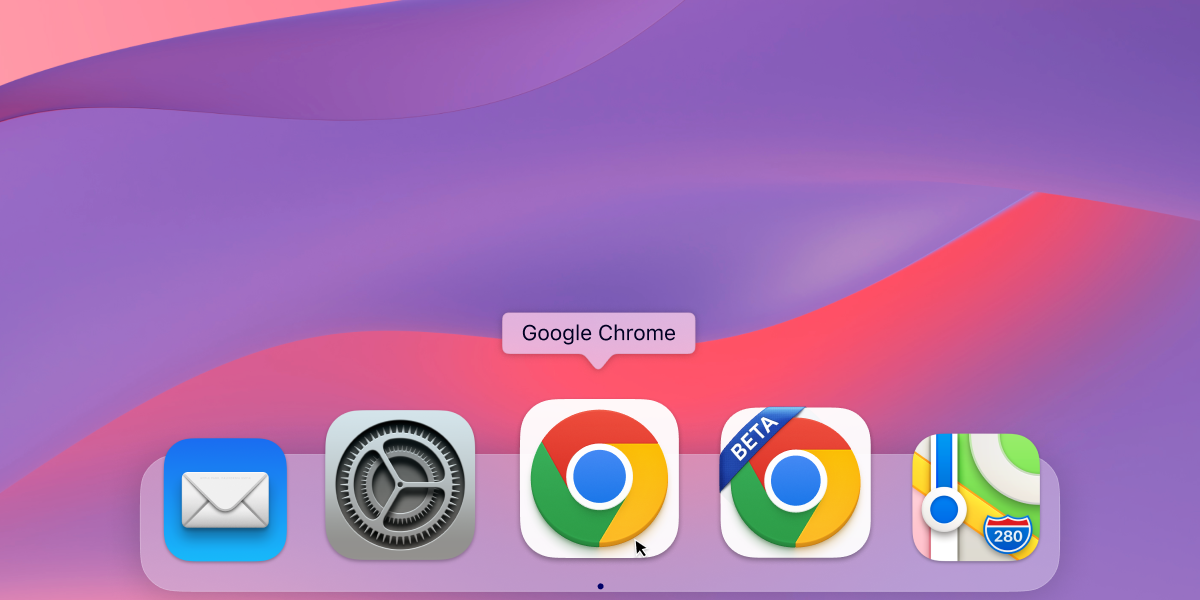
On macOS, the icon looks more 3D. We applied colorful ribbons to indicate the Beta version of the app. The ribbons include many details when viewed at large sizes, but transform into simple badges at small sizes, maintaining their legibility.
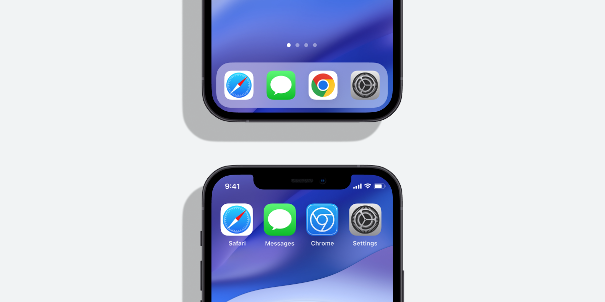
On iOS, our Beta-version of the Chrome app has a blueprint-like design, as a nod to Apple’s developer-focused apps, and the consumer-ready app icon has new proportions on the tile.
It seems like a subtle change. Did you consider a more significant departure?
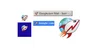
Thomas: We did! In the exploratory phase, we tried all kinds of ideas; softening corners, different geometries, whether or not to separate the colors with white. We also tried options that further departed from the overall shape we’ve been using for the past 12 years. But we knew how well the four Google colors and circular composition are recognized, so we decided not to deviate too much from that.
A few examples of proposed redesigns of the Chrome icon.
What surprised you about the design process?
Elvin: The design process was a fun and collaborative challenge for everyone involved. The team held virtual brainstorm sessions that produced a variety of concepts that strived to become the new “face” of Chrome.
After coming up with the overall direction, we stress tested many color, gradient and proportion options in different contexts. Even if the change to color is subtle, we wanted to ensure the icon would not get lost in any of the places it appears. At one point, we felt happy about a specific green gradient in the icon, but after comprehensive testing, we found that it blended in with the default Windows 11 wallpaper (and taskbar) – which is popular with lots of our users. It was tests like that which ensured our icon would work well everywhere.
Caption: Several rounds of stress tests were conducted to ensure the icon’s color palette would work cohesively across platforms and contexts.

How did you think about making the icon more accessible to more communities?
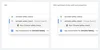
Thomas: We revised the proportions of the central blue ball. Working with Googlers who are low-vision, we found that the refined proportions and updated central white stroke made it more recognizable. We also made different versions of the icon for small sizes to improve legibility and avoid fuzziness by aligning to pixel boundaries.
A side-by-side comparison of Chrome actions and how the updated icon improves legibility at smaller sizes and aligns to pixel boundaries.
Would you ever bring back the original Chrome icon?
Elvin: Never say never! We’ve investigated custom app icons, and found that each platform has different levels of support for it. Maybe one day we will bring it back as an option on platforms that support it.