Finding "A Space for Being" at Salone del Mobile in Milan
Do you have favorite music that helps you unwind after a long day? Is there a particular scent that transports you back to your childhood? Or does a soft blanket on your lap help you feel calmer as you sit down to read?
These reactions are our bodies’ responses to our surroundings, whether it's something we see, touch, smell, taste or hear. Designers intuitively consider these sensory inputs to evoke certain feelings in people. Neuroaesthetics, a scientific field of study that explores the impact of aesthetic experiences on human biology, offers insight into which inputs evoke specific responses. It’s the reason your heart rate may change when you touch certain fabrics and why your energy level could shift based on the colors around you.
Neuroaesthetics gives scientific backing to what designers have always known: design matters. It’s because of this intuition that our team of hardware designers built our Made by Google products using certain colors, like the Not Pink hue option for Pixel 3 phones, and specific textures, like the fabric base on the Google Home Hub. We always strive to build products that fit seamlessly into your life, and make you feel “at ease.”
Today, we’re opening “A Space for Being,” our exhibit at the design conference Salone del Mobile Milano, that explores this connection and endeavors to make the impact of design more visible.
The exhibit, built in conjunction with Muuto Design, Reddymade Architecture and the International Arts + Mind Lab at Johns Hopkins University, is made up of three spaces furnished to look like rooms in a home. However, there is more than meets the eye in the overall design experience.

An artistic rendering of "A Space for Being," Google's 2019 Salone del Mobile Milano installation, which endeavors to explore neuroaesthetics and was developed in partnership with Mutto, Reddymade Architecture and the International Arts + Mind Lab at Johns Hopkins University. Visitors spend five minutes in each of the three rooms engaging with their surroundings. Photo credit: Google Design Studio + Reddymade Architecture.

The first of the three spaces for being, called "Essential." Photo credit: Maremosso Studio.
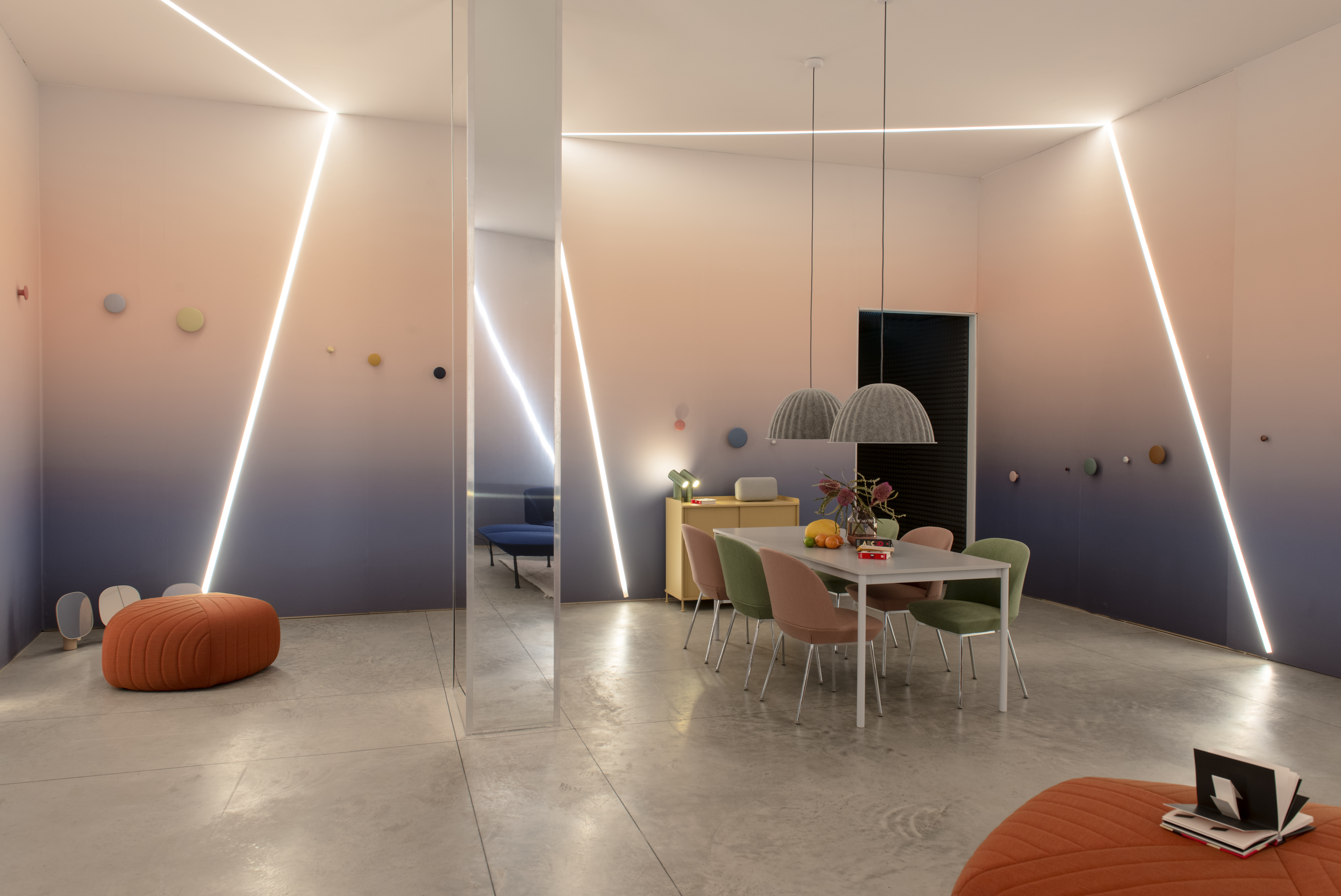
A Space for Being's second room, "Vital." Photo credit: Maremosso Studio.

"Transformative," visitors' final stop before receiving a customized readout of their experience. Photo credit: Maremosso Studio.

When guests visit "A Space for Being," we ask them to put on these specially-made bands that capture how they respond to each room. Before their data is deleted from the band, each user receives a customized printout describing the space where they felt most "at ease." Photo credit: Maremosso Studio.
Each space features a distinct look, feel, scent and sound, complete with unique textures, colors and design elements. As attendees walk through the spaces, they’ll wear a specially-made wristband that measures biological responses such as heart activity, breathing rate, skin temperature, skin conductivity and motion. At the end, before each guest’s data is deleted, they’ll see a visual representation of their response to each room and receive a customized readout that suggests which space made them feel most “at ease.”
Take a look at some of our spaces in the photos above, and think about what makes yours “A Space for Being.”
