Explore California design, from self-driving cars to search

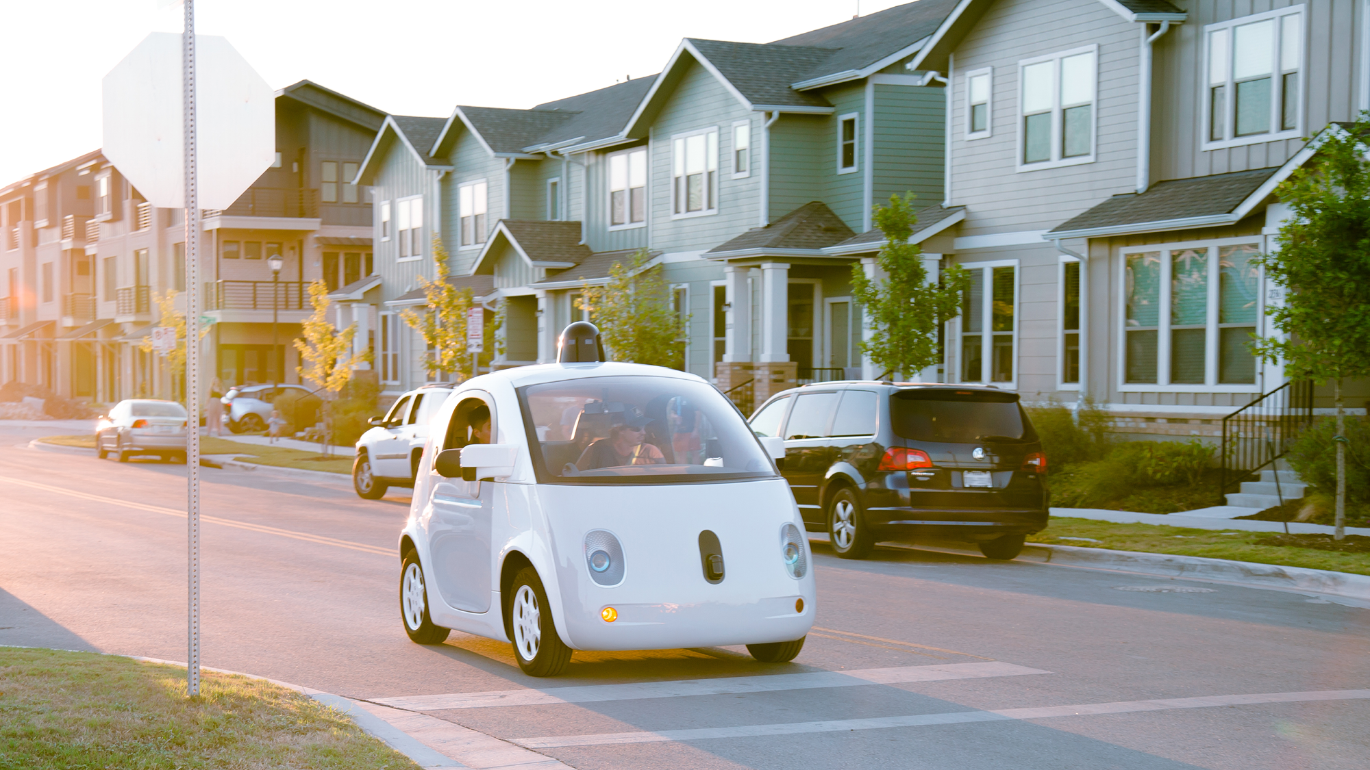
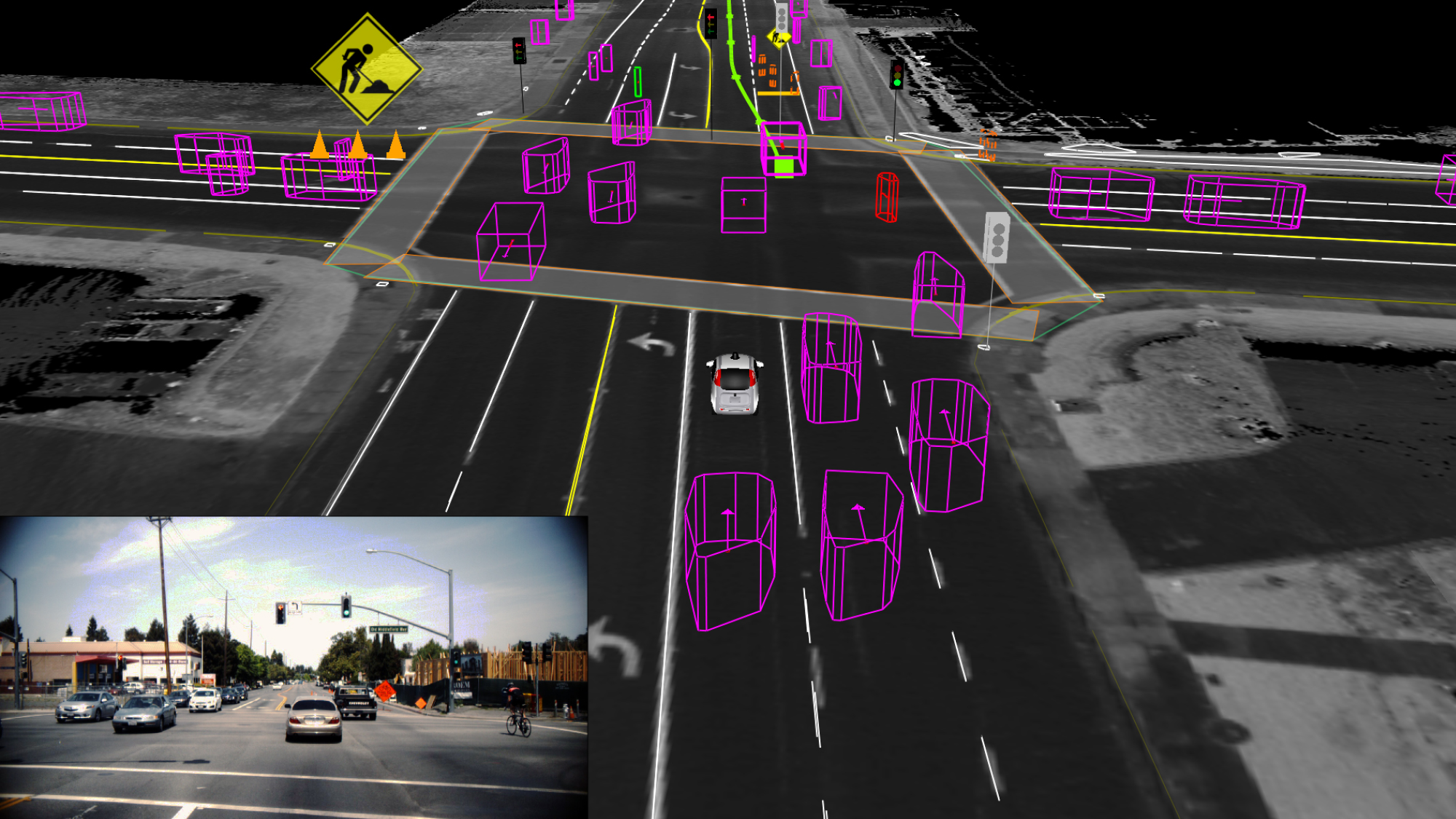
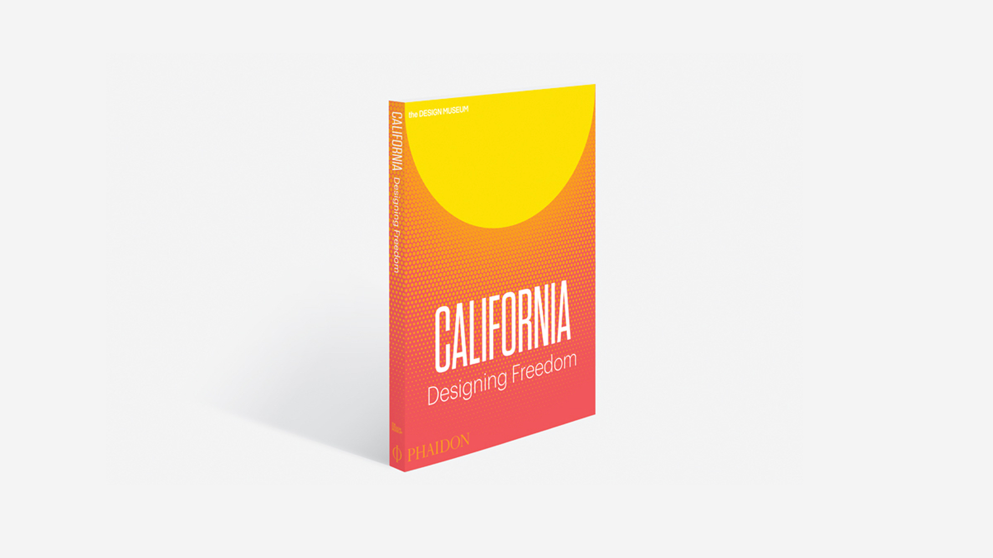
When you think of California, what comes to mind? An exhibition opening today at the Design Museum in London explores the state’s outsize influence and examines how California has shaped and expanded the way we think about design. Spanning from 1960s counterculture to innovative tech in Silicon Valley, California: Designing Freedom features more than 200 objects and includes everything from political posters designed by nun and activist Corita Kent in 1965 to Waymo’s self-driving car (on public display for the first time in the UK).
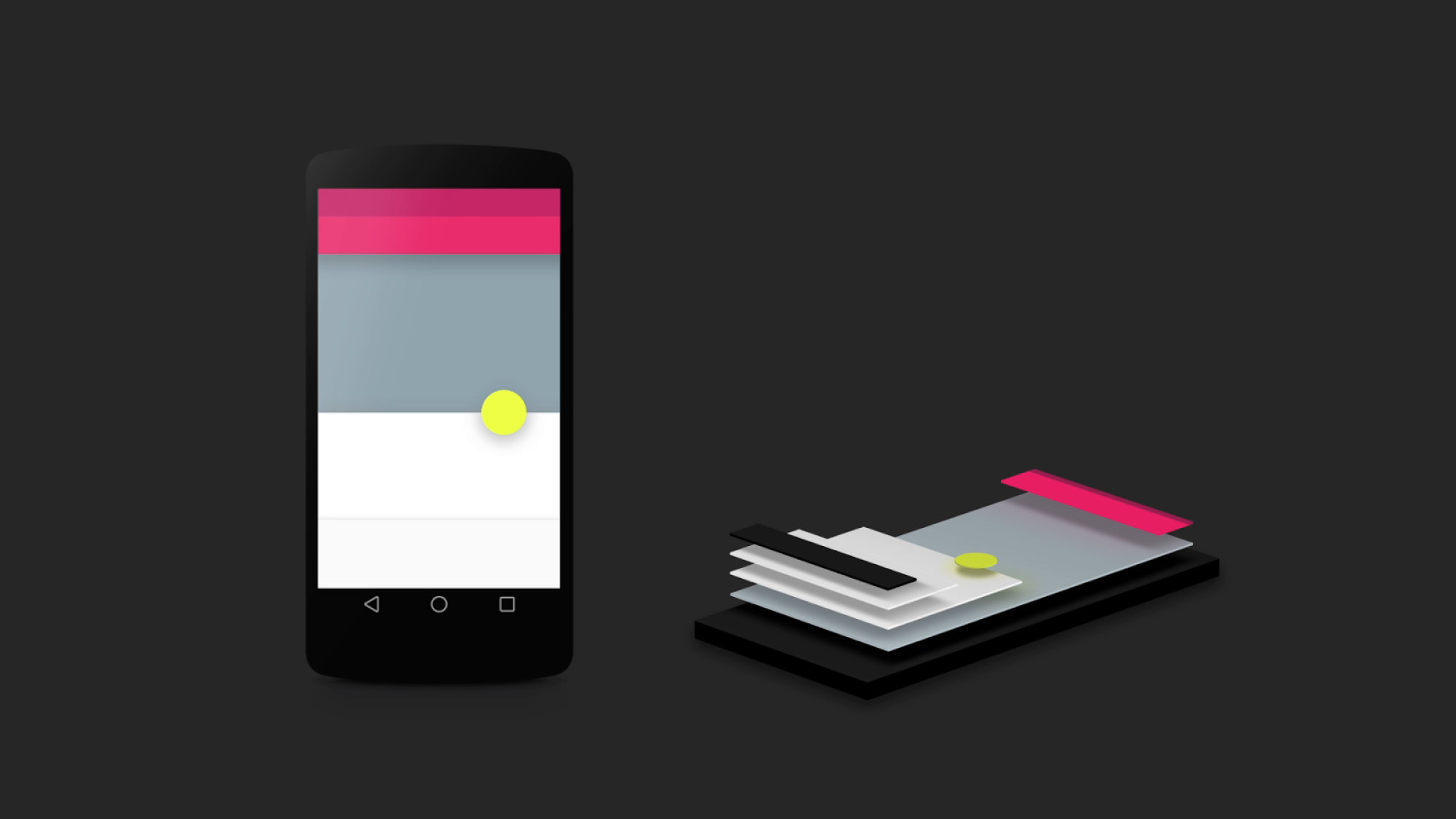
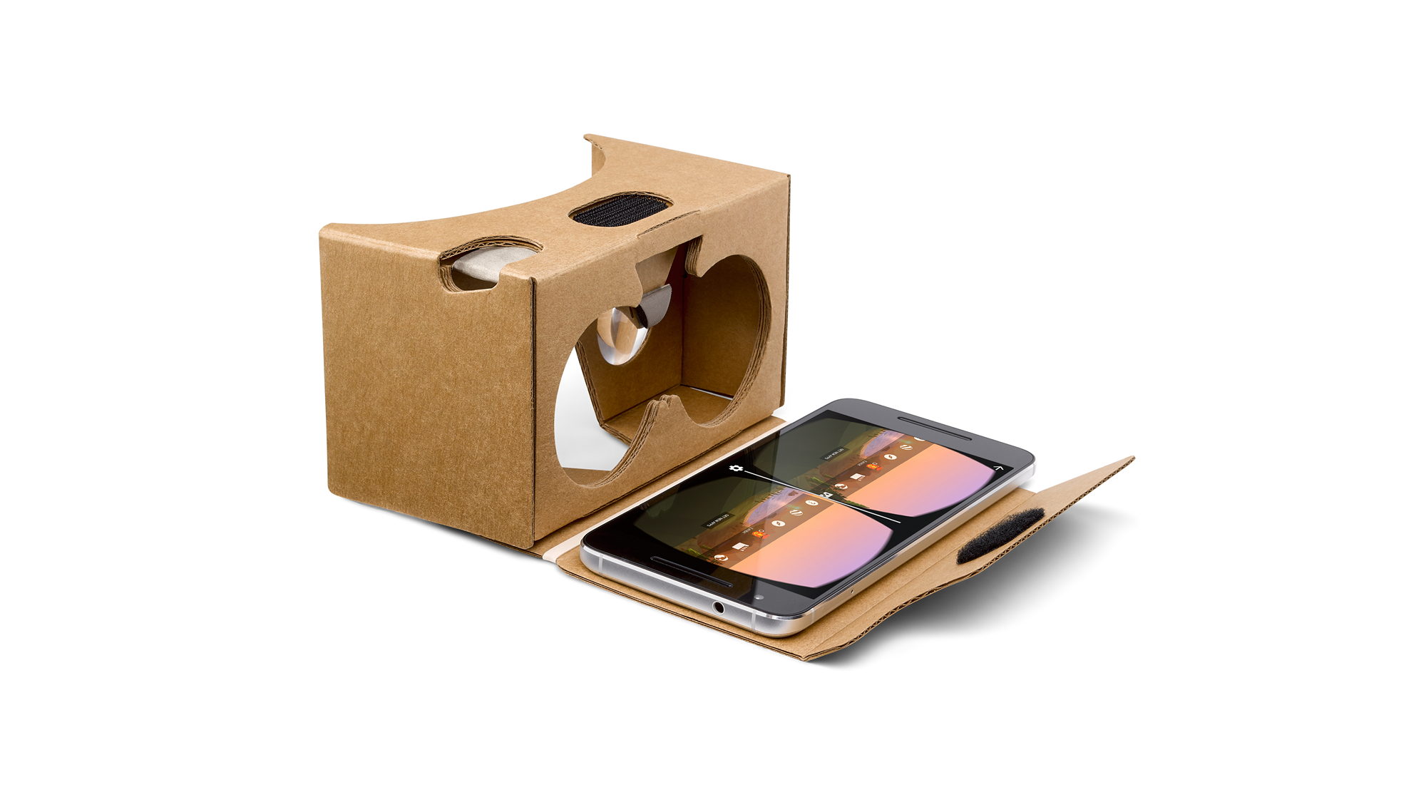
Through the exhibition, curators Justin McGuirk and Brendan McGetrick examine how software and hardware designers in the San Francisco Bay Area influence our daily lives in significant ways. Notably, the exhibition highlights several collaborations between designers, engineers, and researchers at Google, to create products like Google Cardboard, Search, Google Maps and Material Design. Here are a few examples of Google’s work featured in the exhibition:
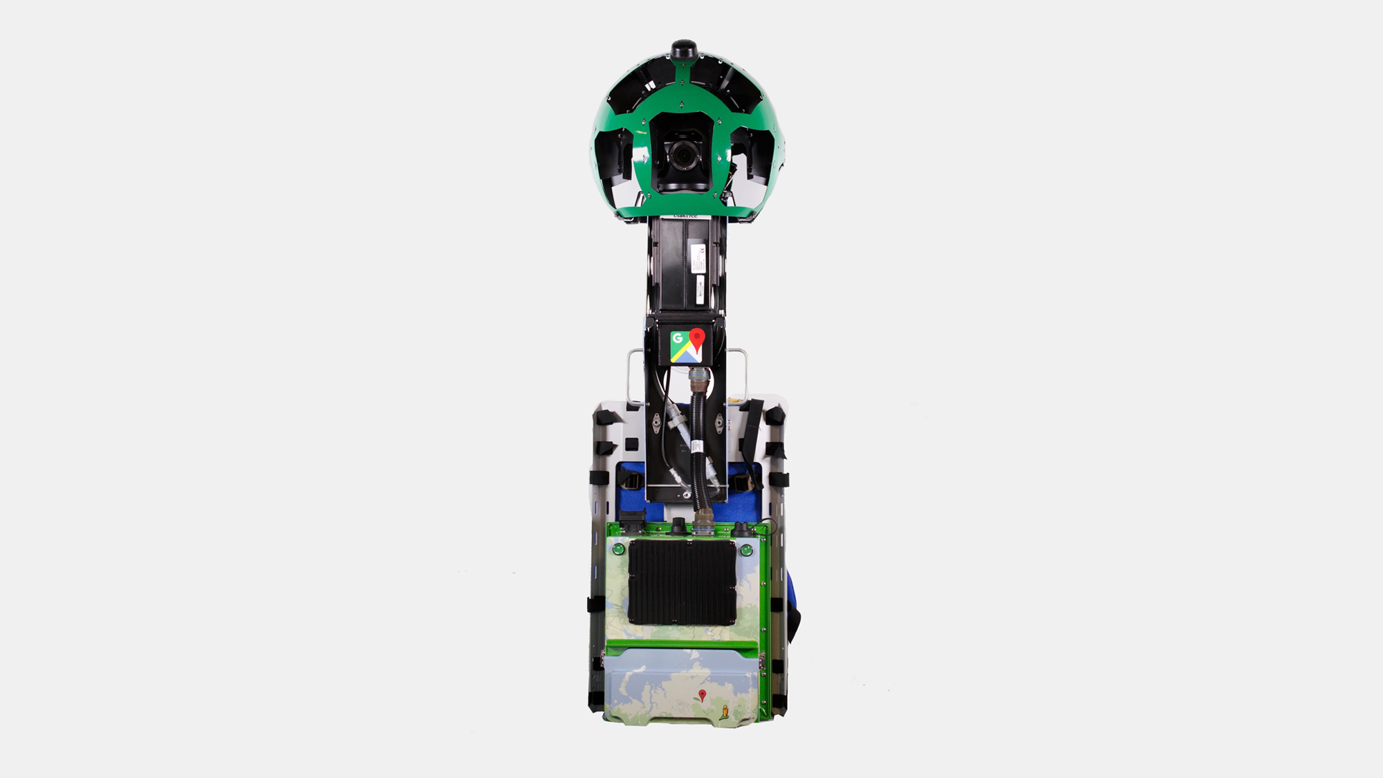
As VP of Design at Google, I find this exhibition particularly exciting because it gives the public an inside look at the process of designing great software. It’s an honor to be part of California’s rich design story, and we’re thrilled to have such diverse work included alongside our peers. Justin and I recently discussed California’s defining characteristics and the evolution of our design system at Google in an interview for the show’s catalogue. An edited and condensed version of the interview is below.
Justin McGuirk: You were initially quite skeptical about the idea of California as a center of design. Can you explain why?
Matias Duarte: Software (for lack of a better term to describe the medium that Silicon Valley operates in) is very new. Software grew up in a pragmatic “can we just get things off the ground?” way.
Design, as opposed to engineering, touches the human experience. If you’re building an airplane that’s just going to haul cargo back and forth, the human experience is not prioritized. Once you have passengers, then you start to consider everything about the human experience: aesthetics, comfort, and ergonomics. Silicon Valley was a lot like that, which is why for a long time we saw this naïve expression in our software interfaces. There was almost an endearing primitivism to it. So I’d find myself hiring people from New York or Hollywood to do these things. But it’s changing.
You’re head of a department called Material Design. What does that mean?
I started working in concert with design leaders across Google to come up with a design system that we’d use across the company, which meant for Android, iOS and the web. And then I thought let’s work on a design system that makes the fundamentals of these software experiences easy and useful for everyone, so designers and developers aren’t starting from scratch. And we ended up calling that Material Design. We rallied the company around that banner, updating products across all these platforms. And when that was done, I went to Sundar [Pichai] who had just become CEO, and I said, if this is going to be an actual change at Google, we need to make this not just a mountain we climbed once and patted ourselves on the back for, we need to make this an ongoing effort. It needs to be a product—for all our developers and all the third parties that are hungry for things like this.
Why did you call it Material Design?
We were thinking about how we wanted designers to perceive it. We had a tagline for this unnamed thing—a system for rational space, form, and motion. The metaphor is: think about appropriately designing with the material of software, in the same way that if you were learning to be an architect or an industrial designer, you would learn to design with wood or steel or aluminium.
What is it that makes software design unique as a medium?
Just like wood or steel or glass, software has certain properties—one of these properties is that it’s constantly evolving. It doesn’t require someone to go back to the store to buy a better one. It evolves in reaction to your interactions, or to advances in technology. And that deeply influences the way that software is designed. It’s intrinsically iterative as you’re trying to approach a better solution.
In many ways, that is one of the defining characteristics of design from California, this impatience to get a product out into the world so that it can be updated and improved. It’s a new design methodology based on a culture of rapidly evolving tech products.
Google comes from a background in software, so there’s a willingness to be transparent about the process. We iterate in the public space because we’re not the kind of company that thinks we can do our best work by hiding it. This is how Californian companies are starting to think.
California: Designing Freedom is on view at the Design Museum in London through October 15, 2017. To learn more about design at Google, visit Google Design and sign up for our newsletter.
