Why Chromebook keyboards have lowercase letters

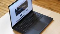
If you’re reading this article on a Chromebook, look down.
You’ll probably notice that all the keys on a Chromebook keyboard are lowercase. And they've been that way since the first Chromebook prototype, the CR-48, was launched in 2010.
Lowercase keys as far as the eye can see…

“Early on, we realized it would be great if the keyboard was really approachable,” says Alexander Kuscher, a senior director on the ChromeOS team who was involved with early Chromebook designs. “So we asked ourselves, ‘What can we take away? What is the minimum number of keys that we have to have? How can we make this a great experience?’”
That’s when the lowercase lightbulb went off.
“We're so used to the keyboard being capitalized, but if you're going to a text field to start a document and you start typing on a traditional keyboard, the keys don't match what shows up on the screen, right? You press a capitalized ‘D,’ but a lowercase ‘d’ appears,” says Donny Reynolds, a senior product manager on the Chromebook team. “So we decided Chromebooks would be different: If you press a key, then that’s what you’ll get.”
Android kicked off the lowercase keyboard revolution back when the original G1 launched in 2008.

At that time, many phones and tablets already had simplified modern keyboards — Android phones launched with a lowercase setup when they debuted in 2008 — but most laptops and desktops could still date their keyboard design back to the first commercially successful typewriter, 1874’s Remington No. 1, which could only type in uppercase characters. “If you look at many modern PCs or laptops, their keyboards still carry a lot of legacy from those early computing days: all-caps keyboards, insert keys, home, page up and down, caps lock,” Donny says.
The team’s goal was to come up with a more modern, less confusing keyboard that addressed a number of these legacy features. For example, Chromebooks don’t have "Sys Req" keys, and that concerning “Break” key is nowhere to be seen. And there are just a pair of repeated keys — control and alt — on each side of the keyboard instead of a confusing array of function and platform-specific keys.
But there is one key that the team added: the Everything Button. Located on the left side of the keyboard (where you’ll usually traditionally find the Caps Lock key), the Everything Button started out as a search key, complete with a magnifying glass icon, before shifting to its modern iteration: a solid circle surrounded by a ring.
Chrome’s Everything Key — the circle on the middle left-hand side of the keyboard — is another Chromebook innovation that sets our keyboards apart.

“We believed at the time that the future of computing was going to be more search and less shouting at people with caps locK — which turned out to be mostly true,” Donny says. “And now the Everything Button has expanded to all these different purposes: searching the web, finding apps, files, Drive and more.”
We work with manufacturing partners on making sure these things come to all Chromebooks and Chromebook users. Our guidelines include requirements for performance, speed and battery life, but also things like how wide the keys can be, what the pitch of the keyboard is to ensure a good ergonomic experience, and — of course — that the keys are lowercase.
“When we started building Chromebooks, we asked, ‘How can computers be different, and without any of the baggage that they’ve had for decades?’” says Donny. “Appearing friendlier and less intimidating to use is a big part of our computer design, and I think the lowercase keyboard really has become almost its own kind of iconic branding to help achieve that goal.”


