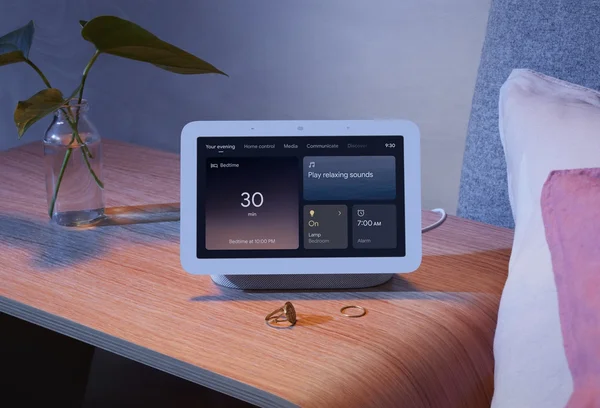
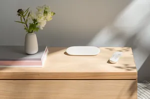
A closer look at the new Nest Hub’s design details

For the Nest Industrial Design team, details matter. Working on the new Nest Hub was no exception. "When we approached the design of the new Nest Hub, we wanted to give the product a lighter, more effortless aesthetic,” says team lead Katie Morgenroth. “We wanted it to feel evolved and refined, not reinvented.” Styling alone shouldn’t be the reason to replace a product, she says. “We want to make sure whether you have one Nest product or many, that they all compliment each other in your space.”
Because of this considered approach, you might not immediately notice some of the more subtle updates. We took some time to talk to Katie, as well as Industrial Design lead Jason Pi and Color and Material designer Vicki Chuang, about some of the new additions worth a second glance — or even a third, or a fourth, or a … you get the idea.
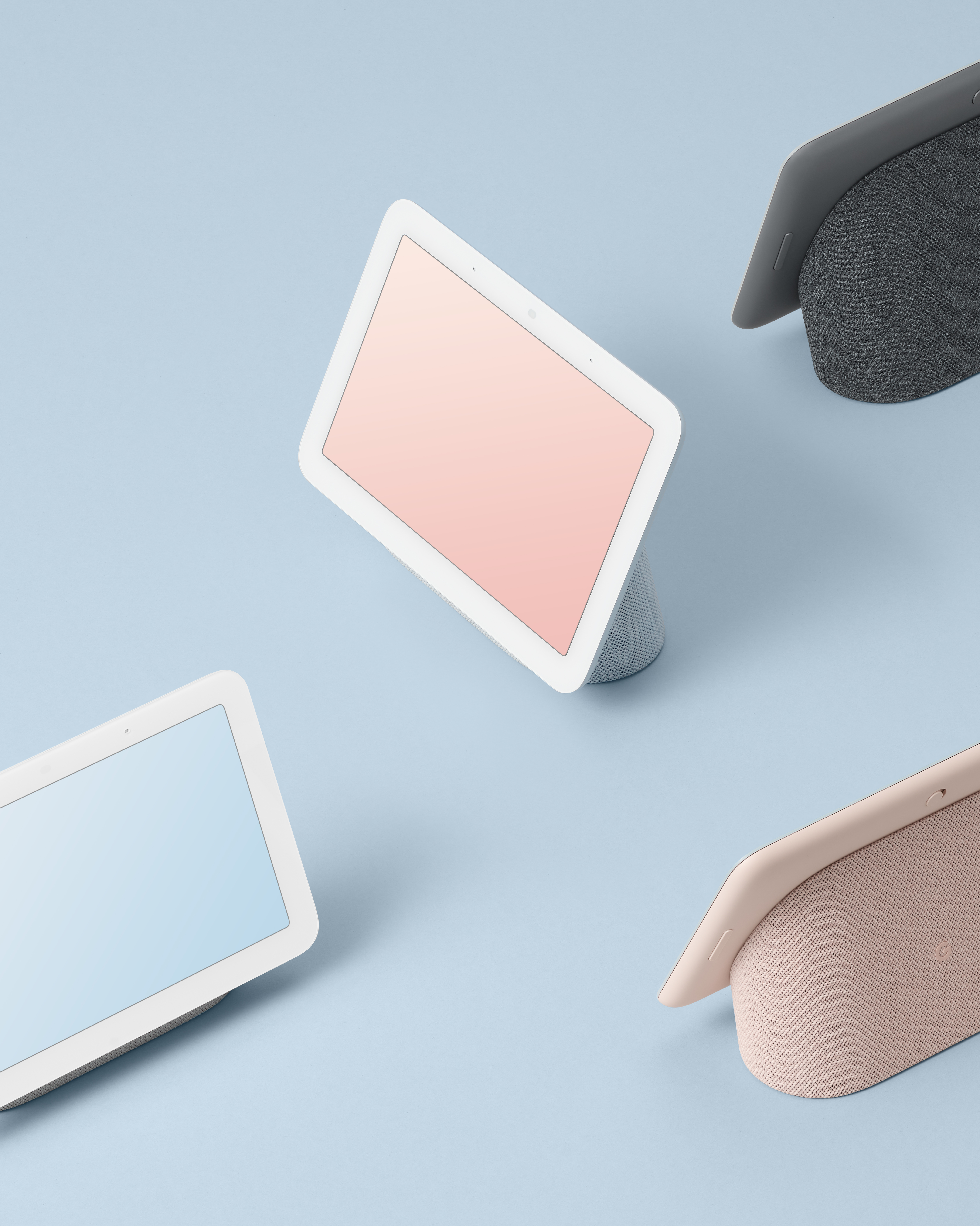
The new Nest Hub comes in Chalk, Charcoal, Sand and the new color, Mist.
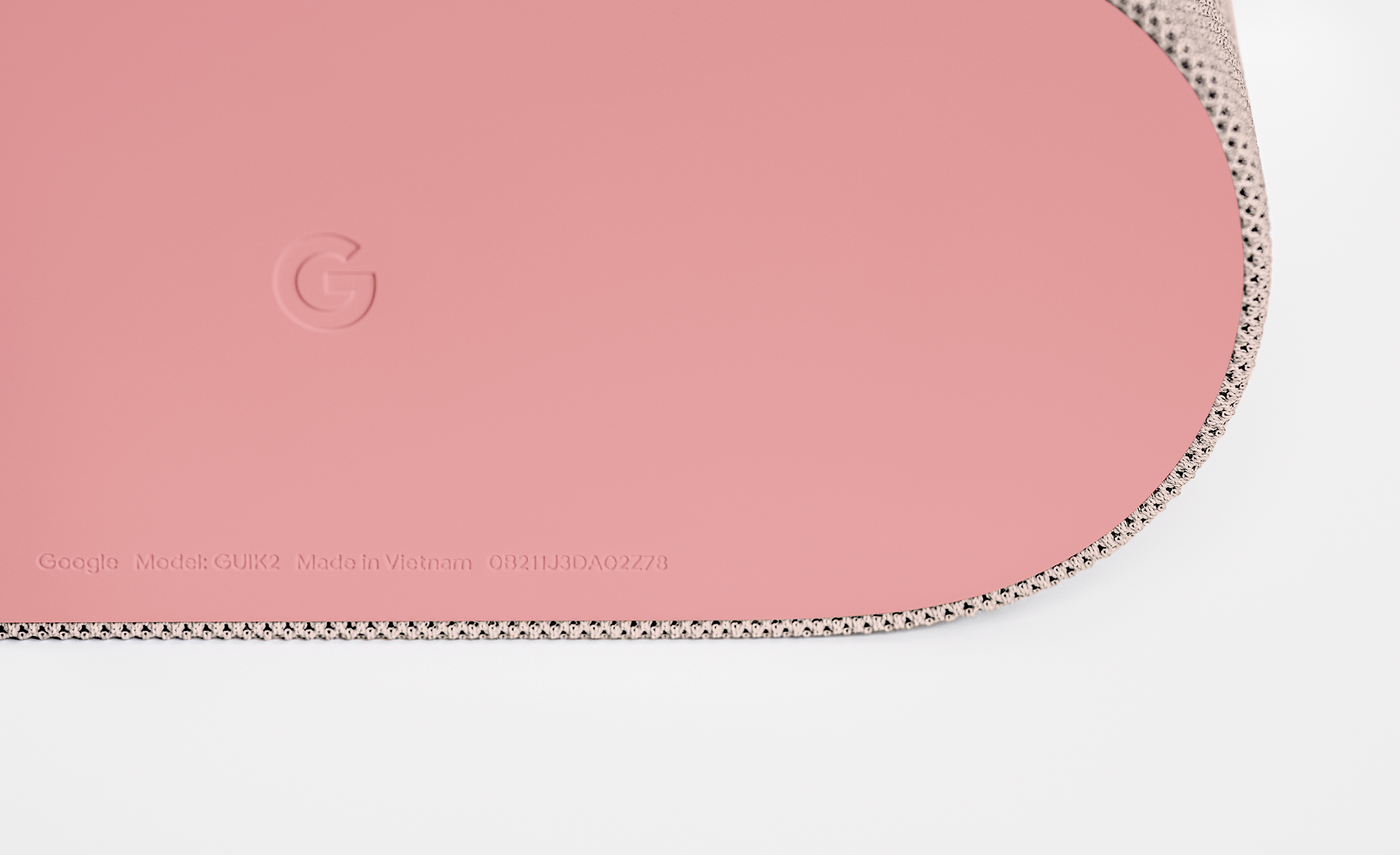
A peek underneath at the Nest Hub’s feet.
The edgeless display makes it look like “it’s floating,” Katie says.
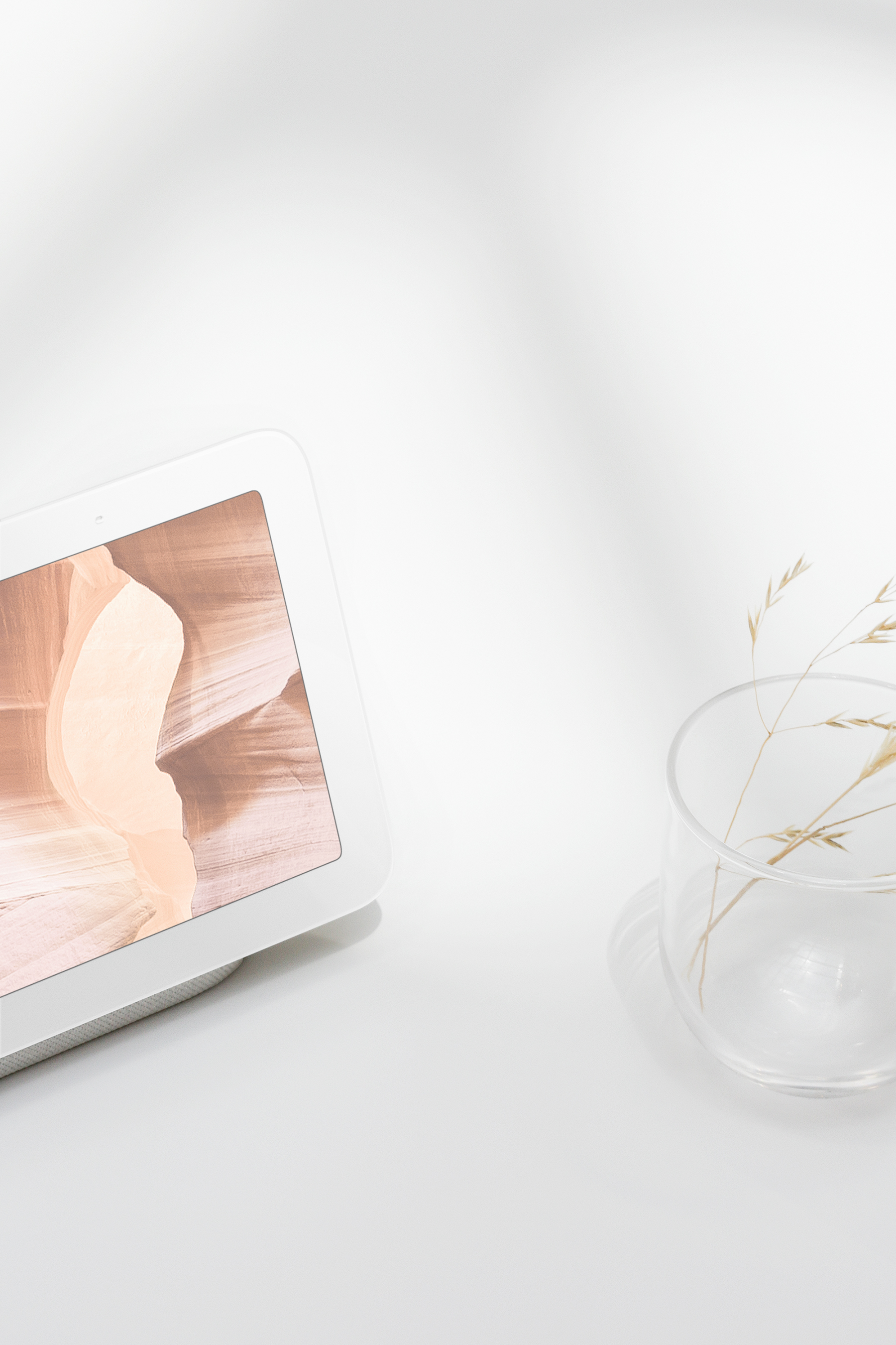
It also makes the Nest Hub an even better home for photos.
The new, cool color. The team introduced the new Mist color because it’s in the cool family, and compliments nature. It’s soothing, and almost looks like a neutral. Vicki led the color and material design, and says that atmospheric colors like Mist help express “soft feelings.” “Color enhances well-being. Mist is inspired by the sky, it compliments nature,” she says. “We started with a range of blues from light pastel to saturated blue, and the soft muted blue felt the most soothing and relaxing — a good fit for the home.”
Don’t forget the feet. Peek underneath the Nest Hub to see the silicone feet. “We try to have a little fun with color there,” Katie says. “We were inspired by the color you see when you cut into a fruit like a guava or a watermelon — it makes you smile.”
The inspiration for edgeless. Our idea for the edgeless display was the look of a piece of artwork or picture frame with a white border. The new Nest Hub has a lighter, more effortless feel, as Katie describes it. “All you see from the front is the glass. It makes the display almost feel like it’s floating.”
Jason also adds that the general construction was an upgrade. "We’re very proud of the matte finish and silky feel of the display enclosure, which is also more sustainable even though it has a premium feel to it.” In fact, the new Nest Hub was designed with 54% of its plastic part weight made with recycled material.
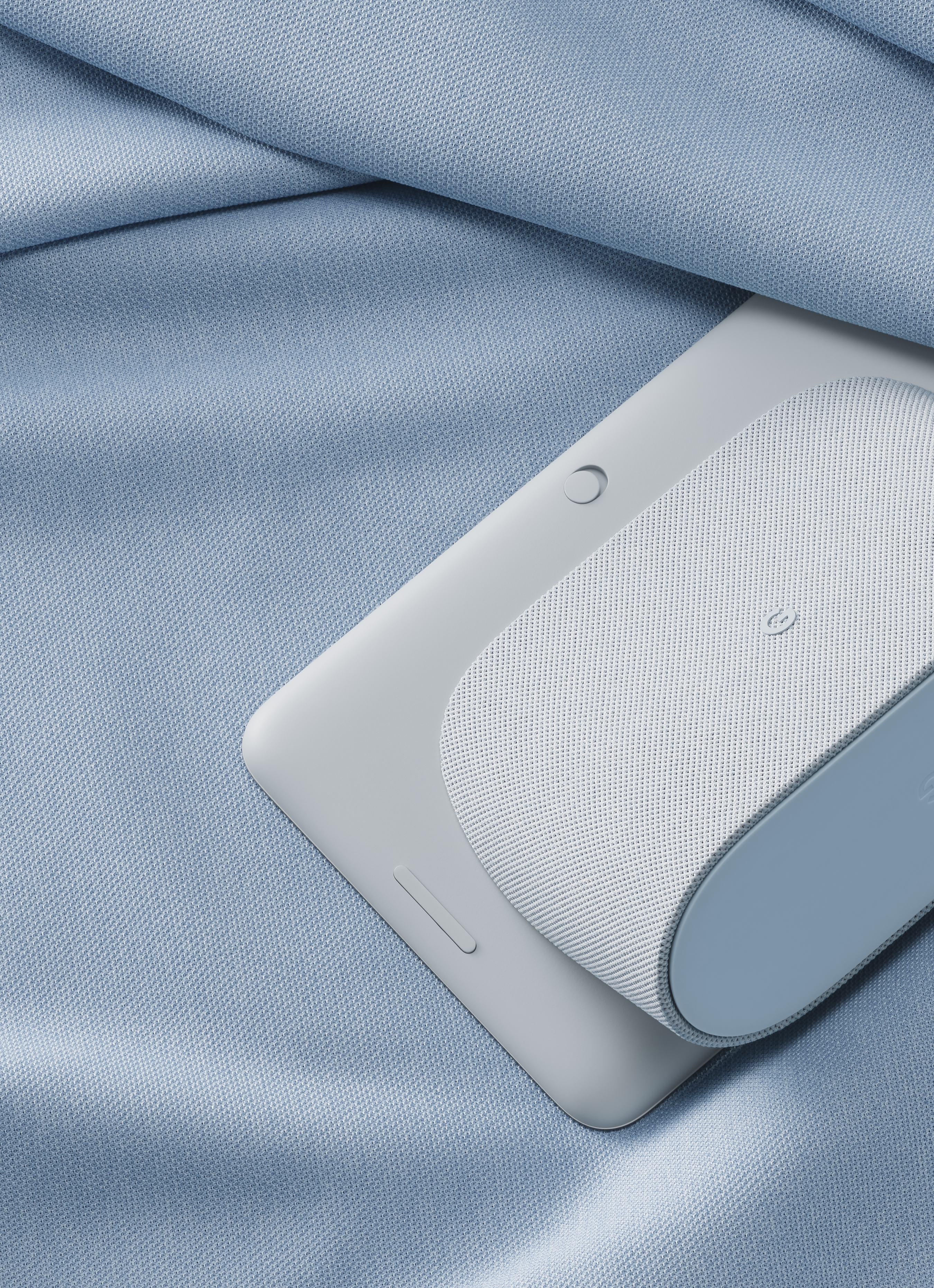
Mist gets its close up.
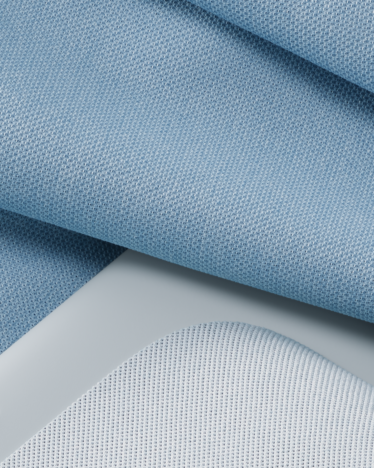
The new fabric is more sustainable and improves the speakers’ sound.
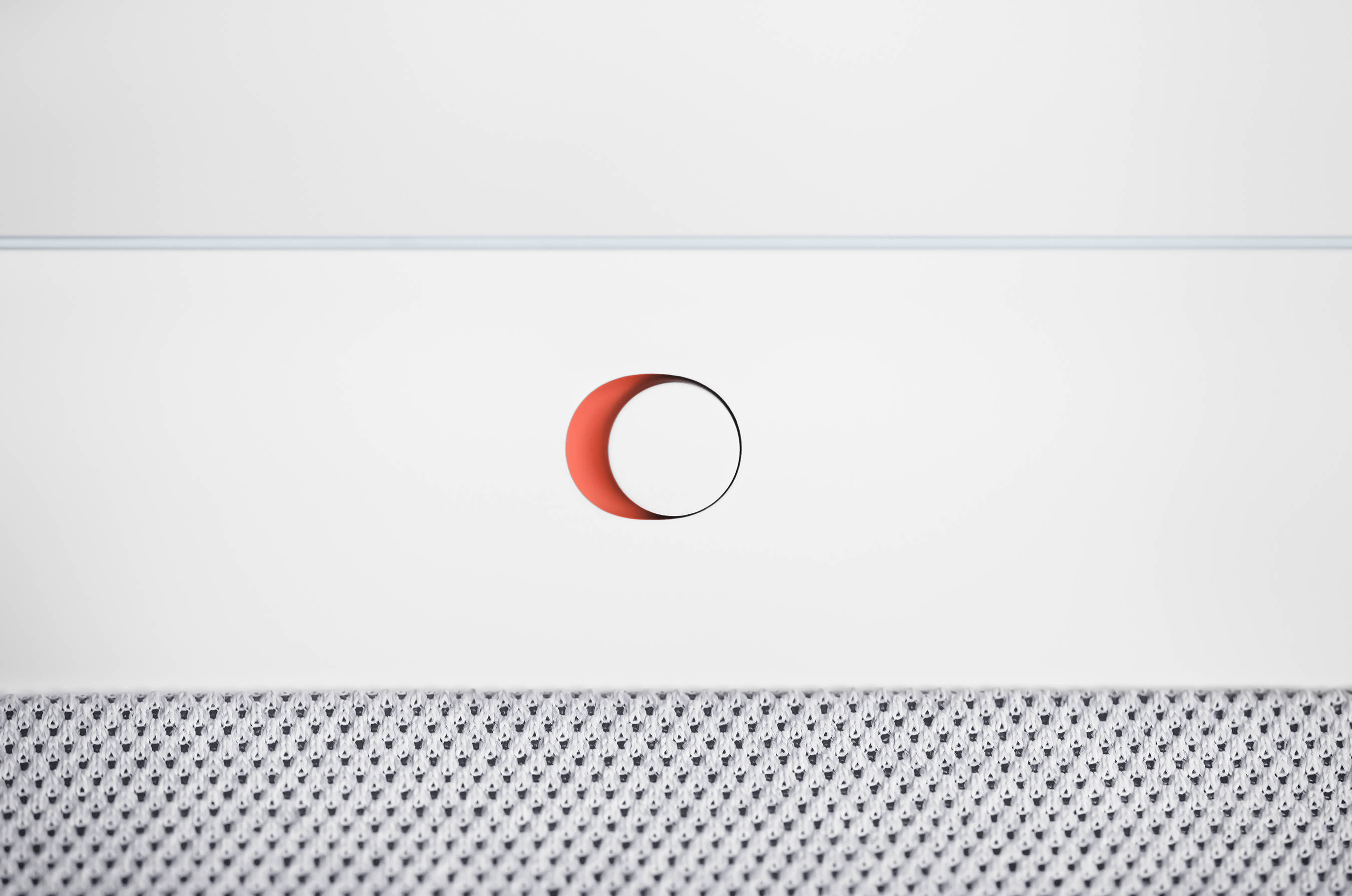
Don’t miss the switch’s pop of color.
A new knit. The new Nest Hub uses the same sustainable yarn recycled from PET bottles that the Minis use, just slightly modified. We used a recycled monofilament yarn, which gives the device a structure that’s ideal for sound quality. “The fabric was reengineered to be not only sustainable but also optimized for great acoustic transmission,” Vicki says.
And look a little closer… and you’ll see the team color matched the device down to the yarn level, so there’s a subtle blending effect in the overall look of the speaker. “That effect is called ‘melange’ and it’s created when there are two colors of yarn knit together to create a variation in the tone,” Katie explains.
A hard switch. We first introduced the privacy switch with the Home Mini and it’s been a part of every Nest device since, including the new Nest Hub. The hard switch completely disables microphones, and the new Nest Hub also has added LED lights to the front of the display that indicate when the switch is on or off. This was important to the team to keep consistent across all Nest devices, because privacy isn’t something they wanted to overcomplicate. “From the beginning we always wanted to continue the precedence we set with the physical privacy button and include it on Nest Hub,” Jason says. “There is something definitive about having it be a physical switch. I also like the color pop that's visible once it’s on mute — it’s a nice, clear indicator.” Plus, it’s one more place designers get to have a little fun.
