Building Google News for everyone—a retrospective

As a former news correspondent for the BBC, I’m a self-confessed news junkie. Now I lead communications for the News team at Google and get to see how news experiences are created from a completely different paradigm—that of aggregating and organizing news versus reporting and writing it.
Google News was one of the first products Google launched beyond Search. Former Googler Krishna Bharat saw that when people searched for news about the tragic 9/11 attacks in New York, the only information available was old stories. He set about trying to fix that. The result: Google News, which went live on September 22, 2002 with 4,000 news sources, letting people find up-to-the-minute breaking news on any story they wanted to learn more about—radical at the time!
A decade and a half later, the need for reliable, relevant and trustworthy online news is greater than ever—something that was front of mind when we relaunched Google News this past May. As part of this month’s look back on Google’s 20-year history, I dusted off my old reporter’s notebook and spoke to two key people involved in re-thinking the future of news experiences: Trystan Upstill, a distinguished Google engineer and engineering and product lead for News across Google, and Vidhya Bhat, product manager for data on News and creator of the product’s Full Coverage feature.
An internal test version of Google News from December 2001, nearly a year before its launch in September 2002

Maggie: Last year, the team challenged themselves to re-imagine Google News as if it had never existed before. How did you approach such a daunting project?
Trystan: We started by locking ourselves in a room for 30 days to think deeply about the problem. We emerged with three goals: first, make finding news less overwhelming. Second, piece together a full story and go beyond the headline in a complete and “unbubbled” way. Finally, make news fast, and feel like it was built around the phone.
To distill all the information flowing around the web, we designed the app around a “pyramid of importance” principle. Top headlines are clearly important for everyone, so they’re at the top. Then we jump to all the local news that connects you to your community—like school funding, etc.—and finally we go to information that’s fairly unique for you.
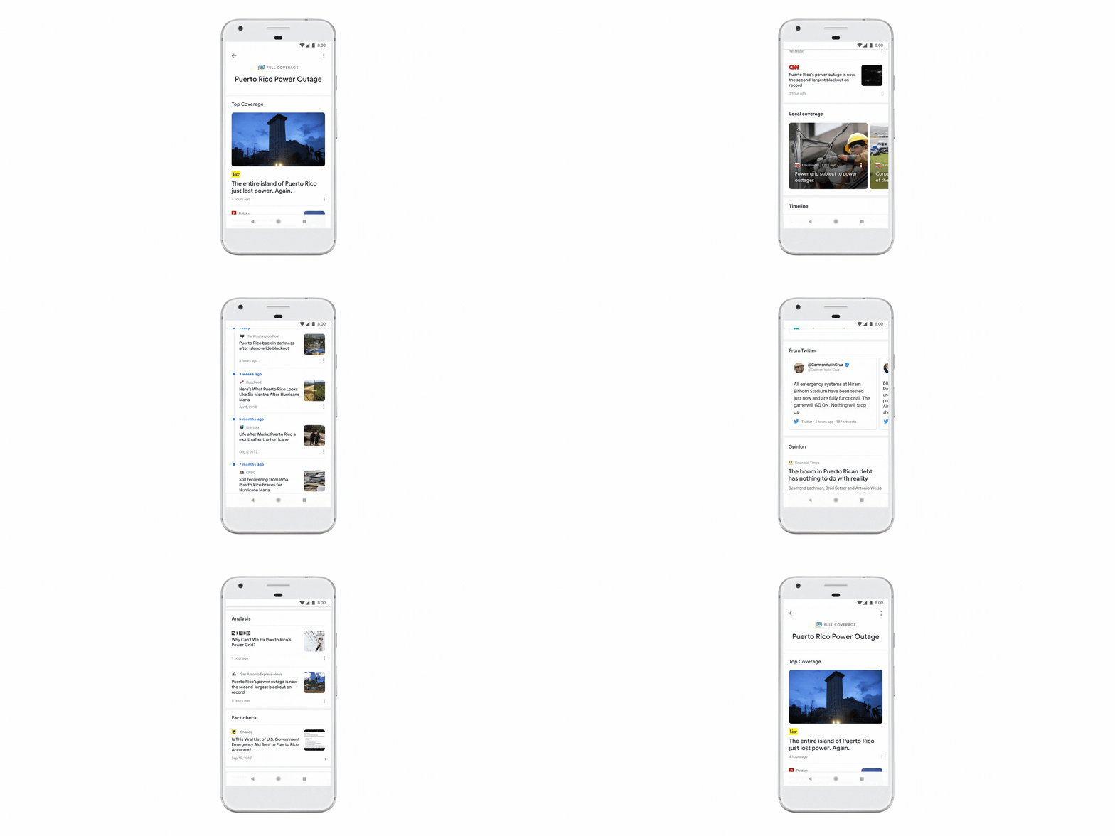
To give people full coverage, we went back to a core tenet of Google News: Articles are more interesting—and sometimes more useful—when viewed in the context of many other articles written around the same topic. Context of how an article fits into a longer timeline is important, so we introduced timelines. And as you read a story it’s critical you position it around a full narrative, so we used AI to pull out key aspects and assemble them; including opinion pieces but also content like fact checks or live coverage. We even pulled together voices from Twitter and elsewhere so you can see commentary about a topic.
Finally, to build this in a way that really rocks on a phone we used AMP content to ensure quick loading faster content, pulled in media-rich content from places like YouTube, and worked with the Google Material Design team to make our app look really slick—and feel great in your hand.
On the left, Google News as it appeared when it launched in 2002. On the right, the new Google News, introduced in May 2018.

Vidhya, you were the person who came up with building the Full Coverage feature—tell us more about the ethos behind that feature and some of the challenges.
Vidhya: Although parts of the new Google News app is personalized, we didn't want people to get stuck in a filter bubble. We wanted to help people see diverse perspectives and also make it enjoyable to get context around a story. That’s why Full Coverage is unpersonalized and everyone sees the same content.
Of course, we had to figure out how to do that in a way that was clean and compelling for people so they would explore the full breadth of a story. So we went through several iterations of structuring the Full Coverage page. Should information be presented inline or in tabs? Should they be categorized based on journalistic forms such as Opinion, Analysis, Commentary? In the end, we organized the feature based on how people assimilate information in the real world: know, understand, build perspective, and react.
Full Coverage

We all know the news industry is facing challenges with revenues and readership. How did you think about the effect this new product would have on publishers?
Trystan: Clearly without high-quality publications and the content they create there would be no news experience. We put publishers front and center throughout the app, making it easy to see what you’re reading, and introduced the Newsstand section so it’s easy to follow the sources you love, as well as discover new ones. We also spent considerable time understanding how we can better highlight local coverage, which often has the best on-the-ground reporting.
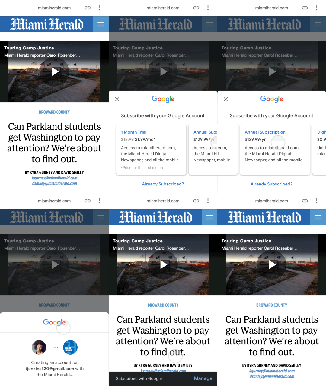
When you subscribe to a publisher, you should have easy access to your content wherever you are. So we also developed Subscribe with Google, which lets you use your Google account to subscribe and access your subscriptions everywhere, in Google News, Search, and on publishers’ own sites.
Subscribe with Google

Today there are a lot of questions about trusting information online, including issues like filter bubbles and misinformation. How did you think about solving for that?
Trystan: We started with Google’s solid foundation in fighting misinformation from our experience with related issues like identifying webspam. We’re always learning and improving our core algorithms.
Our research also showed that one of the best ways to fight against misinformation is to help people see additional perspectives on the same topic. So the app is designed to show you quality content from a diverse set of trusted publishers and sources, and frame around reliability, for example using Fact Check databases.
To combat information silos, the daily briefing includes the big stories that everyone sees, alongside news that is personally important to you. The Headlines tab also gives you a completely unpersonalized view of what’s going on in the world. Every step of the way we make it easy to get you out of your news comfort zone.
Google News has users all over the world who vary widely from age to interests and news needs. Tell me how you create a product that works for everyone.
Vidhya: It’s not easy to create a product by generalizing user needs. We did extensive UX studies, field studies and ran experiments to identify distinct user personas and then designed the product with them in mind. For example, for people that aren’t interested in hard news and mainly prefer videos or humor we introduced “Newscasts”—auto-scrolling, interactive cards showing the content Google has around a story in a lean-back overview experience. There’s a dedicated section for users focused on local news. And for people who mostly care about news that concerns them but want to know a little bit about everything, we have the briefing and a personalized feed. Finally, for news junkies who want to know everything about a story, we built the Full Coverage page.
Trystan, someone mentioned that when you were at university in Australia, you actually tried to build a news aggregator—long before Google News actually existed. Life has come full circle for you!
Trystan: It was a fun project called My News Network. It looked great, had awesome machine learning, and was built using the latest and greatest web technology—HTML 3.2. In fact, it would be fun to see what it would like on a phone from the period. I think they still looked like bricks, and the most exciting feature was the game “Snake.”
Wait, actually, I miss Snake. Snake was super cool.
This month we’re celebrating 20 years of Google and Google Search—how do you think about Google News and how it ties in with our original mission?
Trystan: Compared to 20 years ago, the world of online content today is much larger, far richer and filled with great things—but it’s hard for people to find those things amidst the hundreds of thousands of documents, videos, tweets and more hitting the web every minute. Google News still sits right at the core of organizing the world’s information and making it universally useful and accessible. And in a world where our users are often feeling overwhelmed, or like they’re only seeing some of the information, we think this is more important than it ever has been.


