Inside the Google team that dreams up colors
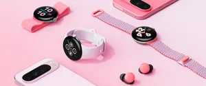
How do you bring a new color to life? Just ask Isabelle Olsson, who leads Google’s Color, Materials and Finish team. “Every year we work on hundreds of new colors, but maybe one or two make it,” she says. They dream up colors for things like Nest Minis and Pixel phones and develop them from scratch. Their goal is to create colors you’d love to see, not hide away in a cabinet or case.
Isabelle Olsson

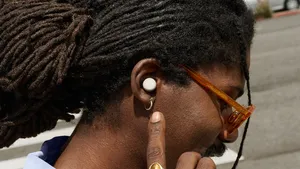
Among the latest to make the cut can be found in the new Pixel Buds: Oh So Orange, Clearly White, Quite Mint and Almost Black. I recently spent time talking to Isabelle about why color is so important and where she finds inspiration—and of course, which Pixel Buds shade is her personal favorite.
Where did your interest in design first come from?
There’s been one consistent thing I've always wanted to do, and that’s make people smile. When I was little, industrial design wasn’t a profession I was aware of, so I did things like stage design for plays, designing costumes and jewelry and building doll furniture. Eventually, when I went to art school, I found a way to combine my creative side with my problem-solving side, because I also loved math and physics.
Nearly all of us have a favorite color, often starting when we’re little. Why do you think that is?
Color is the foundation for living. Look at flowers, some of which evolved to look bright to attract bees. There’s something about color that reminds us we are alive. And color is very personal, and so culturally specific to the setting and context we’re in. You even see different preferences depending on the climate you live in; if you’re in a hot climate you might prefer different colors than if you’re in a cooler climate.
Electronics used to just be black…then black and white...then the occasional gray. What are some of the things that opened this space up to more variety?
For a long time, tech for tech’s sake was enough, but I don’t think it’s enough anymore. There’s a reason when you go to a paint store there are literally hundreds of shades of white. We really believe that color, material and finish affect your wellbeing.
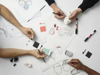
A look at a few sources of color inspiration the designers use.

At Google, we’ve set out to create products that fit into people's lives, and you just plainly can't do that without color. When we create our palette for the different product categories, we really think about where a product is going to live. Is it in your pocket or next to your bag, or is it going to live on a shelf or on that beautiful wooden cabinet you got from your grandma? We think about how we can fit in or stand out in that environment.
What are some color and finish trends you’ve noticed in electronics?
There’s been this transition away from designing furniture to hide technology, like those media cabinets people shoved electronics in. Our goal is to design things that people are happy to have out in the open, that fit beautifully next to whatever vase you have, or a pair of earbuds you choose the same way you choose a jacket or a bag.
What real-world inspiration goes into color selection?
We try to live with the objects and the colors we design. For instance, when we design something for the home, be it a new color or a new shape, we place it on a shelf. Then every day for a week we walk past it, and we start seeing things we didn’t previously see. We don't just design something and look at it and then it’s done. We try to live with the objects and the colors. These days, we’re sending product models to our houses and living with them in our homes.

We also bring back objects from trips as inspiration. A toothbrush, a bar of soap, a little plate, a spoon—seriously, anything. Then in the studio, we have drawers for these things from all over the world organized by materials. We even have one that’s labeled “organic,” and that’s always fun to open because you never know what you’re going to find. Sometimes it’s stones but sometimes I’m like, What’s that smell? Then we use these objects to make physical mood boards. It’s this idea of turning off your logic brain and turning on your intuition side.
How do you make sure you don’t jump onto temporary color trends?
One thing we do is look at markets for longer-lasting products. It’s like furniture: It’s not like you buy a new couch every year, it’s maybe every five or 10 years. We can be inspired by fashion, but it's important to know that it can be a very quick cycle. It’s important we ask ourselves if something is a short term trend or a lasting movement.
What was the process for choosing the Pixel Buds' colors?
We had this vision of this little dot floating in your ear. It’s almost like little candies, so we had bowls of candy in the studio for inspiration.
Creating colors for something that goes on your body is so different from creating colors for something you hold in your hand or put on a shelf; it needs to coordinate with different hair styles, different skin tones and how people dress. We knew we could love a color when we looked at it, but what happens when it goes in the ear? We did a ton of prototyping and experimentation and then narrowed it down to around 100 colors, and then narrowed it down to 25. Then we tried them on a ton of people and photographed them, and we started to see some common themes of what worked in the ear and what just looked good on the table.
For a while we had two dark neutrals and I thought, Wait a minute, that seems like a wasted opportunity. That’s how we brought back the green color, Quite Mint, which is my favorite and hadn't made the cut at first.
I know there are different internal names for colors. What were some of the Pixel Buds’?
We called Quite Mint “pistachio,” which isn’t quite actually the right color but we liked the name! And I think we just called Oh So Orange “sun orange.”
I think my favorite device color name is Purpleish for the Pixel 3a.
That’s my favorite name to this day because it felt so to the point! In some light, it’s purple, in some it’s sort of white, so it’s purple...ish. I loved it.
Head to the Google Store to check out the Pixel Buds colors, which are available next month. (Not all colors are available in all areas.)

