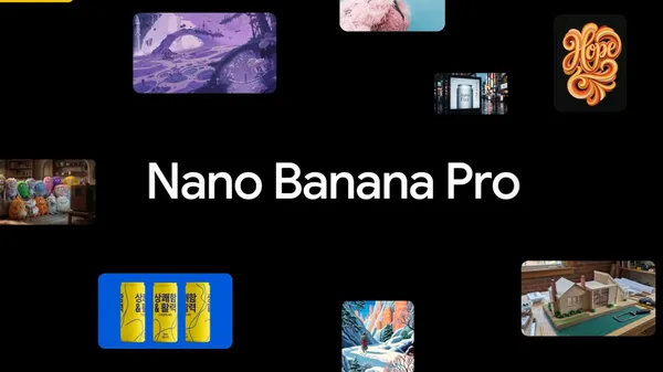
7 tips to get the most out of Nano Banana Pro
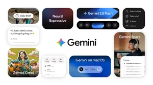
We’ve given Nano Banana a massive upgrade. Built on Gemini 3, Nano Banana Pro is our most advanced image model to date, ready to bridge the gap between imagination and professional execution.
Available now in the Gemini app and starting to roll out in AI Studio, Vertex and more, it features state-of-the-art text rendering in over multiple languages, and advanced controls like the ability to input up to 14 images into a composition (varies by surface).
To get started with this powerful new model, check out our launch post and this guide below on crafting effective professional prompts.
Establishing the vision: Story, subject and style
To achieve the best results and have more nuanced creative control, include the following elements in your prompt:
- Subject: Who or what is in the image? Be specific. (e.g., a stoic robot barista with glowing blue optics; a fluffy calico cat wearing a tiny wizard hat).
- Composition: How is the shot framed? (e.g., extreme close-up, wide shot, low angle shot, portrait).
- Action: What is happening? (e.g., brewing a cup of coffee, casting a magical spell, mid-stride running through a field).
- Location: Where does the scene take place? (e.g., a futuristic cafe on Mars, a cluttered alchemist's library, a sun-drenched meadow at golden hour).
- Style: What is the overall aesthetic? (e.g., 3D animation, film noir, watercolor painting, photorealistic, 1990s product photography).
- Editing Instructions: For modifying an existing image, be direct and specific. (e.g., change the man's tie to green, remove the car in the background)
Refining the details: Camera, lighting and format
While simple prompts still work, achieving professional results requires more specific instructions. When crafting your prompts, move beyond the basics and consider these advanced elements:
- Composition and aspect ratio: Define the canvas. (e.g., "A 9:16 vertical poster," "A cinematic 21:9 wide shot.")
- Camera and lighting details: Direct the shot like a cinematographer. (e.g., "A low-angle shot with a shallow depth of field (f/1.8)," "Golden hour backlighting creating long shadows," "Cinematic color grading with muted teal tones.")
- Specific text integration: Clearly state what text should appear and how it should look. (e.g., "The headline 'URBAN EXPLORER' rendered in bold, white, sans-serif font at the top.")
- Factual constraints (for diagrams): Specify the need for accuracy and ensure your inputs themselves are factual (e.g., "A scientifically accurate cross-section diagram," "Ensure historical accuracy for the Victorian era.").
- Reference inputs: When using uploaded images, clearly define the role of each. (e.g., "Use Image A for the character's pose, Image B for the art style, and Image C for the background environment.")
Prompting examples: A showcase of creative techniques
Different prompting strategies can help you craft everything from photorealistic edits to fantastical new worlds. Here are some techniques to try:
1. Generate visuals with incredible text rendering: Sharp, legible text helps you create impactful posters, intricate diagrams, and even detailed product mockups.
2. Create with real-world knowledge: Built on Gemini 3 Pro, Nano Banana uses Gemini 3’s real-world knowledge and deep reasoning capabilities to deliver precise, detailed, rich image results.
3. Translate and localize your ideas: Generate localized text, or translate text inside images. See what products might look like in multiple languages, ready for international markets, and create posters and infographics for use across different regions.

Caption: A black and white storyboard sketch showing an establishing shot, medium shot, close-up, and POV shot for a film scene.
Prompt: Create a storyboard for this scene
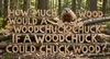
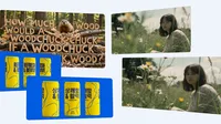
Prompt: Create an image showing the phrase "How much wood would a woodchuck chuck if a woodchuck could chuck wood" made out of wood chucked by a woodchuck.
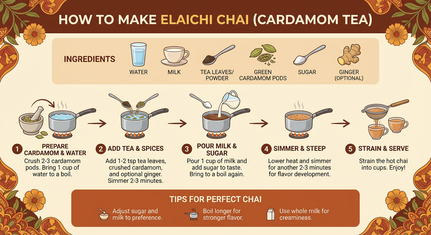
Prompt: Create an infographic that shows how to make elaichi chai
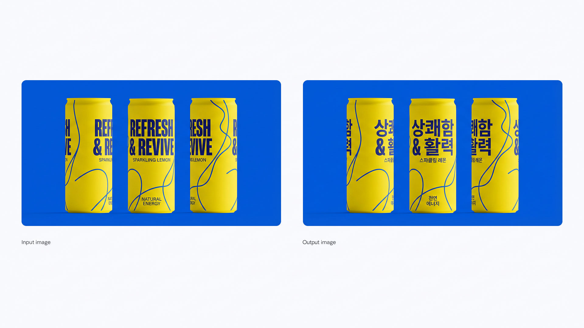
Prompt: translate all the English text on the three yellow and blue cans into Korean, while keeping everything else the same
4. Use studio-quality control edits: Get extensive controls for professional-grade results. Directly influence lighting and camera settings like angle, focus, color grading and more.
5. Resize with precision: Experiment with different aspect ratios and generate crisp visuals at 1K, 2K or 4K resolution across various products.
6. Blend images and keep multiple characters consistent: Maintain the consistency and resemblance of multiple characters, even when they appear together in a group. Take up to 6 to 14 (input number varies by surface) entirely unconnected images and blend them to create something new.
7. Create and maintain your brand look and feel: Render and apply designs with consistent brand styling to visualize concepts easily. Seamlessly drape patterns, logos, and artwork onto 3D objects and surfaces—from apparel to packaging—while preserving natural lighting and texture.
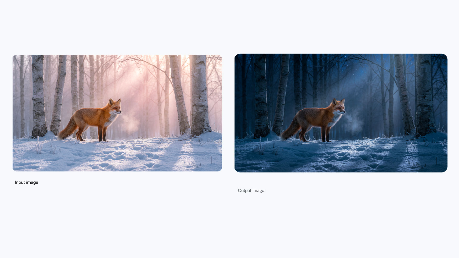
Prompt: Turn this scene into nighttime
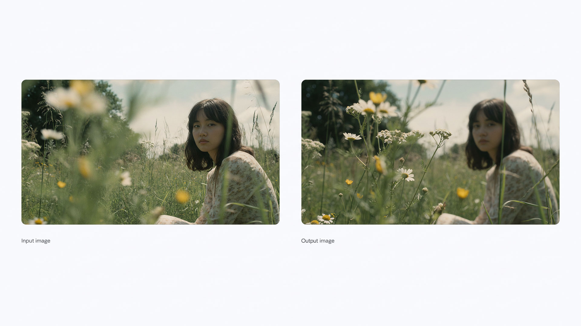
Prompt: Focus on the flowers

Change the look and feel of an image for a range of platforms by adapting the aspect ratio.

Prompt: Combine these images into one appropriately arranged cinematic image in 16:9 format and change the dress on the mannequin to the dress in the image.
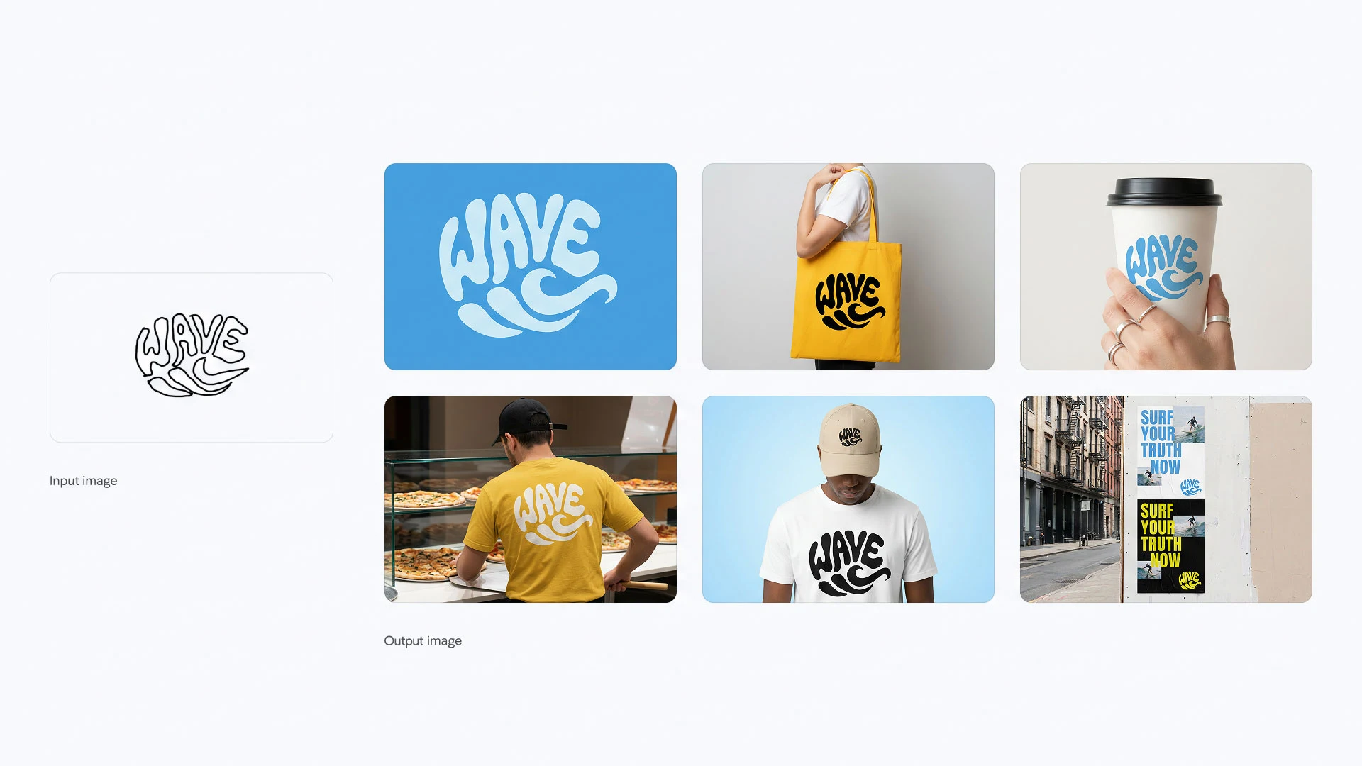
Prompt 1: Create a smooth logo in a graphic style is a vibrant and playful form of typographic illustration, deeply rooted in the retro aesthetics of the 1960s and 1970s loosely based on the sketch Its defining feature is a groovy, psychedelic-inspired typeface characterized by soft, rounded, and fluid letterforms. Don't exactly follow the sketch, get inspired from it. The letters are skillfully distorted, stretched, and compressed, abandoning rigid structure to flow together and form a cohesive, recognizable shape.
This technique, known as a calligram, masterfully merges text and image, where the word's form visually embodies its meaning. The word "WAVE" is artfully arranged into the fluid silhouette of a wave. The design is a clever visual pun, making the message instantly accessible and memorable.
The color palette reinforces the vintage feel, employing a simple two-toned scheme with warm, often muted or earthy colors light blue background and deep blue logo. This choice enhances the nostalgic charm of the artwork. The overall effect is one of whimsical nostalgia and clever graphic design. It’s a bold yet approachable style that communicates a simple, positive message through the seamless integration of shape and word, creating an immediate and delightful visual impact.
Prompt 2: Now create identity system one by one, use 10 high quality mockups with variety of relevant products, ads, billboards, bus stop, etc. generate one at a time, 16:9 each
A note on current limitations
As we continue to develop and fine-tune our models, there are still areas in need of improvement:
- Visual and text fidelity: Rendering small text, fine details, and producing accurate spellings may not work perfectly.
- Data and factual accuracy: Always verify the factual accuracy of data-driven visuals like diagrams and infographics.
- Translation and localization: Multilingual text generation may make grammar mistakes or miss specific cultural nuances.
- Complex edits and image blending: Advanced editing tasks like blending or lighting changes can sometimes produce unnatural artifacts.
- Character features: While usually reliable, character consistency across edits may vary.
We’re actively working to improve these areas and appreciate your creativity as we build the next generation of image tools together.