Augmented reality on the web, for everyone

In the next few months, there will be hundreds of millions of Android and iOS devices that are able to provide augmented reality experiences - meaning you'll be able to look at the world through your phone, and place digital objects wherever you look. To help bring this to as many users as possible, we've been exploring how to bring augmented reality to the web platform, so someday anyone with a browser can access this new technology. In this post, we’ll take a look at a recent prototype we built to explore how AR content could work across the web, from today’s mobile and desktop browsers, to future AR-enabled browsers. Techies, take note: the last section of the post focuses on technical details, so stick around if you want to dig deeper.
How the prototype works
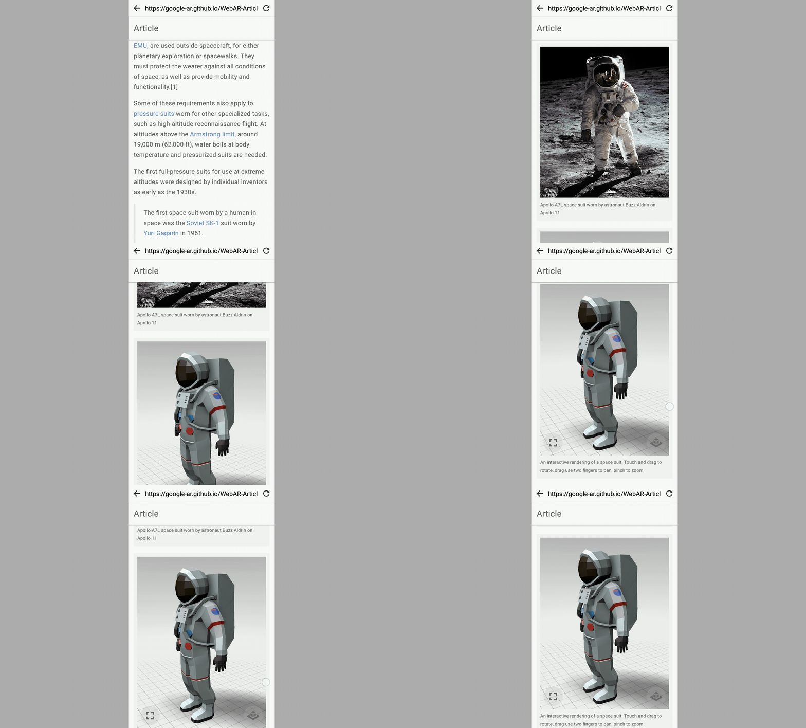
Article is a 3D model viewer that works for all browsers. On desktop, users can check out a 3D model—in this case a space suit—by dragging to rotate, or scrolling to zoom. On mobile the experience is similar: users touch and drag to rotate the model, or drag with two fingers to zoom in.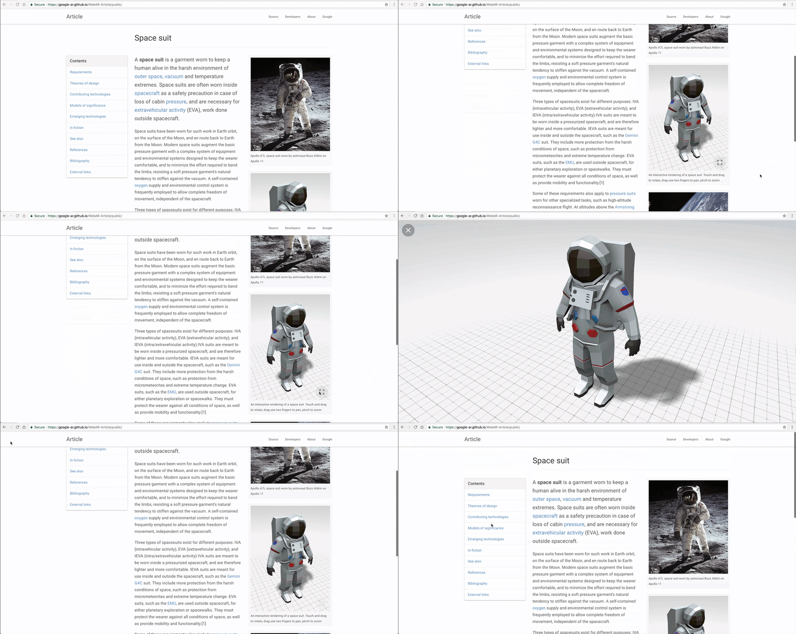
To help convey that the model is 3D and interactive—and not just a static image—the model rotates slightly in response to the user scrolling.
With augmented reality, the model comes alive. The unique power of AR is to blend digital content with the real world. So we can, for example, surf the web, find a model, place it in our room to see just how large it truly is, and physically walk around it.
When Article is loaded on an AR-capable device and browser, an AR button appears in the bottom right. Tapping on it activates the device camera, and renders a reticle on the ground in front of the user. When the user taps the screen, the model sprouts from the reticle, fixed to the ground and rendered at its physical size. The user can walk around the object and get a sense of scale and immediacy that images and video alone cannot convey.
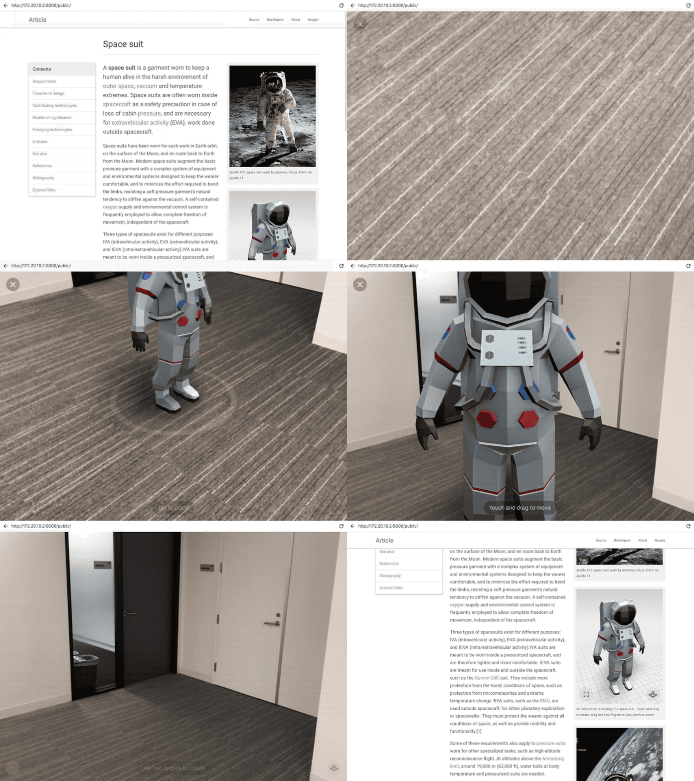
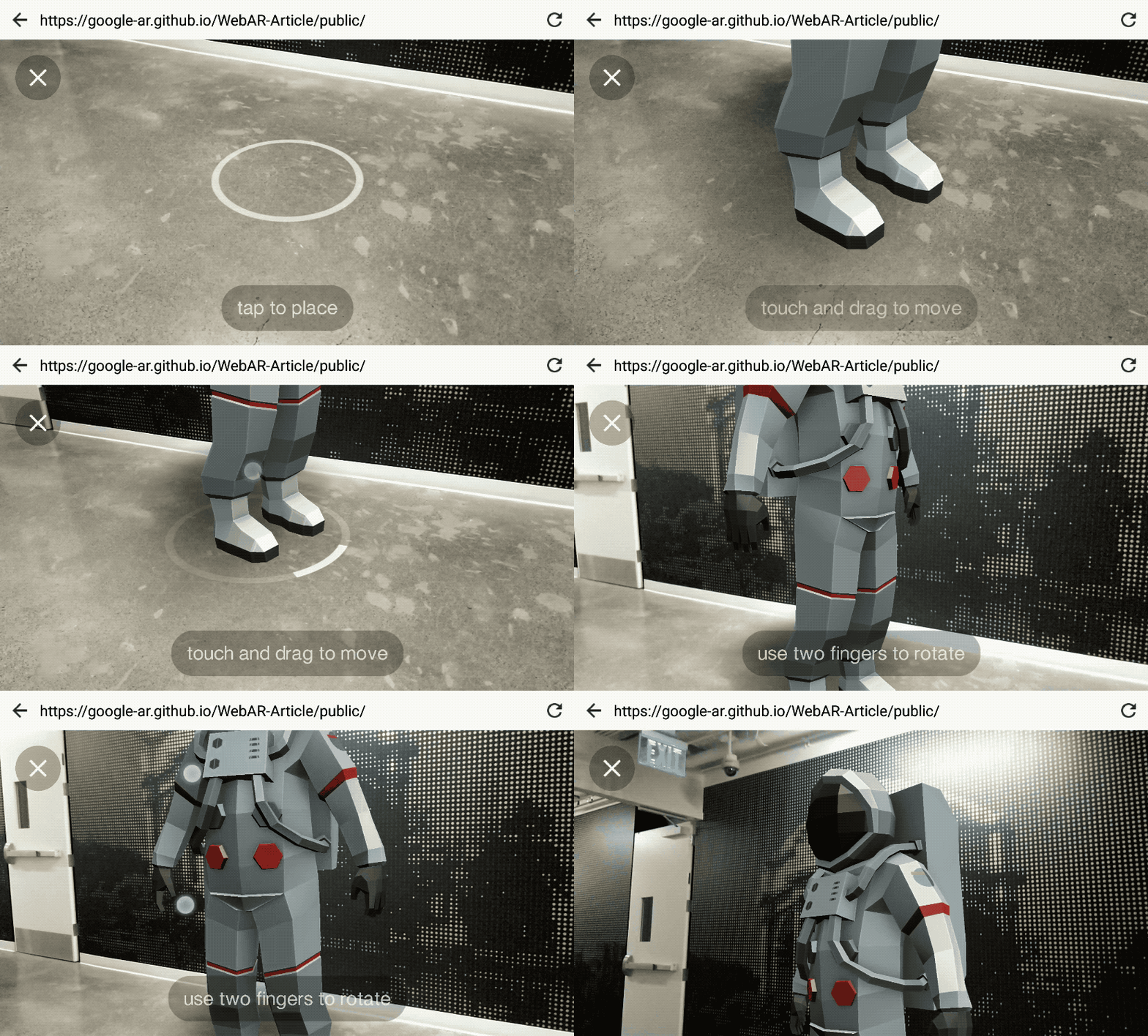
To reposition the model, users can tap-and-drag, or drag with two fingers to rotate it. Subtle features such as shadows and even lighting help to blend the model with its surroundings.
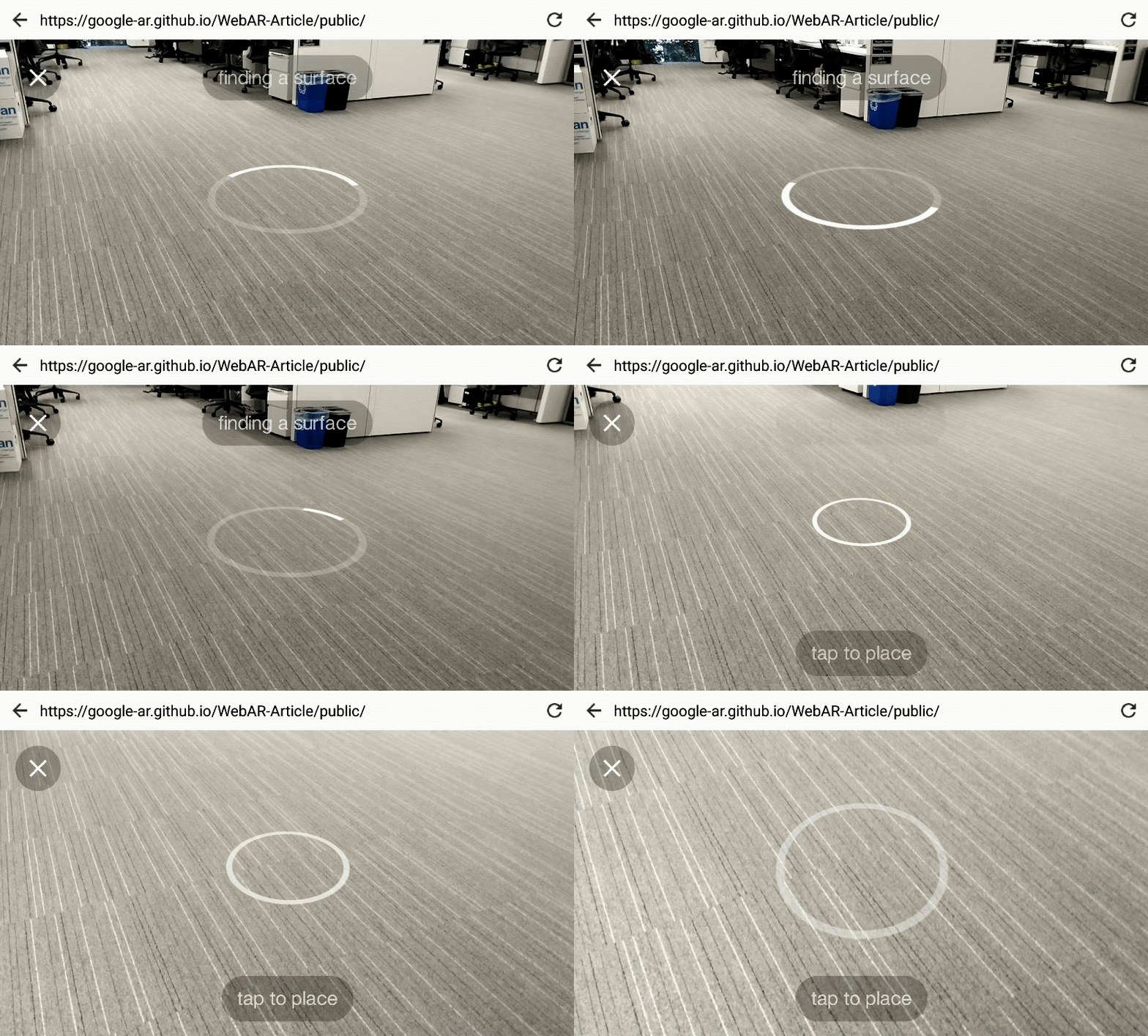
Small touches make it easy to learn how to use AR. User testing has taught us that clear interface cues are key to helping users learn how AR works. For example, while the user waits momentarily for the system to identify a surface that the model can be placed upon, a circle appears on the floor, tilting with the movement of the device. This helps introduce the concept of an AR interface, with digital objects that intersect with the physical environment (also known as diagetic UI).
Under the hood (and on to the technical stuff!)
We built our responsive model viewer with Three.js. Three.js makes the low-level power of WebGL more accessible to developers, and it has a large community of examples, documentation and Stack Overflow answers to help ease learning curves.
To ensure smooth interactions and animations, we finessed factors that contribute to performance:
Using a low polygon-count model;
Carefully controlling the number of lights in the scene;
Decreasing shadow resolution when on mobile devices;
Rendering the emulator UI (discussed below) using shaders that utilize signed distance functions to render their effects at infinite resolution in an efficient manner.
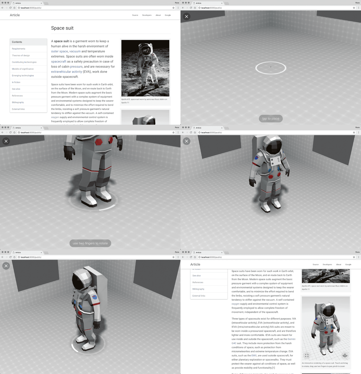
To accelerate iteration times, we created a desktop AR emulator that enables us to test UX changes on desktop Chrome. This makes previewing changes nearly instant. Before the emulator, each change—no matter how minor—had to be loaded onto a connected mobile device, taking upwards of 10 seconds for each build-push-reload cycle. With the emulator we can instead preview these tweaks on desktop almost instantly, and then push to device only when needed.
The emulator is built on a desktop AR polyfill and Three.js. If one line of code (which include the polyfill), is uncommented in the index.js file , it instantiates a gray grid environment and adds keyboard and mouse controls as substitutes for physically moving in the real world. The emulator is included in the Article project repo.
The spacesuit model was sourced from Poly. Many Poly models are licensed under Creative Commons Attribution Generic (CC-BY), which lets users copy and/or remix them, so long as the creator is credited. Our astronaut was created by the Poly team.
Article’s 2D sections were built with off-the-shelf libraries and modern web tooling. For responsive layout and typography and overall theme, we used Bootstrap, which makes it easy for developers to create great looking sites that adapt responsively across device screen sizes. As an nod to the aesthetics of Wikipedia and Medium, we went with Bootswatch’s Paper theme. For managing dependencies, classes, and build steps we used NPM, ES6, Babel and Webpack.
Looking ahead
There’s vast potential for AR on the web—it could be used in shopping, education, entertainment, and more. Article is just one in a series of prototypes, and there’s so much left to explore—from using light estimation to more seamlessly blend 3D objects with the real world, to adding diegetic UI annotations to specific positions on the model. Mobile AR on the web is incredibly fun right now because there’s a lot to be discovered. If you’d like learn more about our experimental browsers and get started creating your own prototypes, please visit our devsite.


