A new look for Google Search
Our goal with Search always has been to help people quickly and easily find the information that they’re looking for. Over the years, the amount and format of information available on the web has changed drastically—from the proliferation of images and video, to the availability of 3D objects you can now view in AR.
The search results page, too, has changed to help you discover these new types of information and quickly determine what’s most useful for you. As we continue our ongoing efforts to improve Search and provide a modern and helpful experience, today we’re unveiling a visual refresh of the mobile search results page to better guide you through the information available on the web.
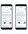
With this new design, a website’s branding can be front and center, helping you better understand where the information is coming from and what pages have what you’re looking for.
The name of the website and its icon appear at the top of the results card to help anchor each result, so you can more easily scan the page of results and decide what to explore next. Site owners can learn more about how to choose their prefered icon for organic listings here.
When you search for a product or service and we have a useful ad to show, you'll see a bolded ad label at the top of the card alongside the web address so you can quickly identify where the information is coming from.
As we continue to make new content formats and useful actions available—from buying movie tickets to playing podcasts—this new design allows us to add more action buttons and helpful previews to search results cards, all while giving you a better sense of the web page’s content with clear attribution back to the source.
This redesign is coming first to mobile and will be rolling out over the next few days. Stay tuned for even more fresh ways that Search can help you find what you’re looking for.
