See how artists turned the elevators into art at Bay View

There’s a lot to take in when you visit Google’s Bay View campus. There are the dragonscale solar panels, the grassy wetlands surrounding the building and…the elevators. Yes, the elevators.
Bay View is a three-building campus composed of large, pavilion-like canopy structures, the highest point of which stands at 126 feet. Inside the two office buildings, there are multiple free-standing elevators that take Googlers to the upper floors designed for team focus. Nine of these elevators aren’t just elevators; they’re also works of art.
Google’s Artist in Residence program worked with local artists to commission work in Google spaces and turn the side panels of the elevators into giant murals. “Bay View is one of our larger projects,” says Josette Melchor, who’s part of Google’s Real Estate and Workplace Services team and oversees the Artist in Residence program’s efforts. “The idea was to create these inner courtyards throughout Bay View that reflect the ecology of the area.” The elevator shafts, which each stand between 32 and 37 feet high, are part of this; mural artists were given five “biomes,” or biological themes, to work with — grasslands, scrubs, dunes, oak savanna and tidal/marsh. The biomes also form courtyards that naturally help visitors find their way around Bay View.
Josette says from start to finish — from the concept stage to the final brushstrokes — the process of working with the mural artists took about a year and a half. “There’s a lot that goes into it that people might not think about,” says Andrea Ceseña, the project producer and curator who worked with the Bay View artists. For instance, all of the artists had to become scissor lift-certified so they could be lifted up to paint the entirety of the elevators. Artists also worked on their murals while occasionally surrounded by the people who would be seeing them everyday — Googlers who work in the Bay View building. People who were working on finishing Bay View also took in the art, Andrea says, which was rather unusual for an art project at Google. “It was about expanded the audience that artists normally have when they’re working on something,” Andrea says. “Everyone was so excited to see the artwork while it was in production.”
But instead of just telling you about these impressive projects, let’s take a quick tour of them — and meet the artists behind them.
Mural title: Untitled
Artist: Brett Flanigan
Theme: Dunes
When you first walk into Bay View’s main entrance and make it through the front lobby area, you’ll notice Brett Flanigan’s elevator shaft mural to your left. Brett is a self-taught artist who says his degree in biology influences his work. “I first consider the initial conditions, including the surface and shape of the wall,” Brett says. “These inform the rules and algorithms I then use to create patterns, as geological events create the specific conditions for the formation of sand dunes.”

Brett Flanigan. Photos via Margaret Austin Photography.

Brett Flanigan. Photos via Margaret Austin Photography.

An early sketch of Brett's mural.
Mural title: “Megalith”
Artist: Carmen McNall
Theme: Oak savanna
Continuing around the space clockwise, you’ll next run into Carmen McNall’s mural, which uses carved wood grain patterns and various neutral shades to suggest the feeling of looking up the trunk of a tree. “I was excited to create a piece that was so vertical and wrapped around the structure,” Carmen says. “I thought about it as a sculptural piece in a way, because it would be seen from many different angles.”
She tried to bring her biome theme — oak savanna, a sparsely forested grassland — to life by incorporating structure into the mural. “I thought about the oak savanna and how all the elements in this environment are so delicately balanced, yet they withstand and regrow despite the threat of fire,” she says. “I decided to incorporate hand carved pieces of wood, which represent the textures and patterns of the oak savanna.”
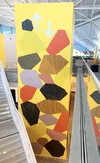
This was the largest piece Carmen had worked on, both literally and in a project management sense. “Working on a 30-foot tall piece was a really empowering experience and I can’t wait to do more projects at this scale — or larger!” she says.
Mural title: “Tidal Moves”
Artist: Rachel Kaye
Theme: Tidal/marsh
After making your way through the first building, you’re on to the next. Here you’ll spot Rachel Kaye’s mural. “I did some research on plant forms in tidal habitats and played around with their shapes until I got a composition that flowed and played around the elevator shaft,” Rachel says of her mural, which was her largest to date and took her two full weeks to paint. She used interior house paint for the mural, as well. "Nothing fancy." Rachel’s mural took inspiration from the tidal/marsh theme, though she hopes people who see it can interpret it however they like. “I try not to steer the viewer in one direction of thinking. I like my work to feel open-ended.”

Rachel Kaye. Photos via Margaret Austin Photography.

Rachel Kaye. Photos via Margaret Austin Photography.

An early sketch of Rachel's mural.
Mural title: “Coastline”
Artist: Tess Rubinstein
Theme: Tidal/marsh
Next comes Tess Rubinstein’s work. “Initially I had a hard time conceptualizing what the elevator shaft would look like,” Tess says. “It’s such a new format, painting a multi-dimensional space instead of a flat wall. It wasn’t until I visited the site that I fully grasped the shape and size of the project.” Tess’s mural was assigned the tidal theme, which was perfect for the artist. “I had just received my California naturalist training and had been learning all about seaweed and how vital it is for the health of our oceans,” she says. “I also live near the coast and spend a good deal of time at the beach, drawing the seaweed and shells that wash ashore.”
Tess focused on the seaweed in her mural because she wanted to pay homage to something that’s incredibly important to the ocean, but often overlooked. “I hope that people feel soothed by the color palette and forms,” she says. “Beyond that, I hope that it provides a moment of reflection on the beauty and value of our surrounding ecosystems.”

Tess Rubinstein. Photos via Margaret Austin Photography.

Tess Rubinstein. Photos via Margaret Austin Photography.

An early sketch of Tess's mural.
Mural title: “Saltgrass”
Artist: Laurel Picklum
Theme: Tidal/marsh
Closely following Tess’s tidal mural is Laurel Picklum’s, also based on the same biological theme. She used Bay View’s surrounding marshes as inspiration, and her upbringing and career path certainly show up in her work. Laurel was raised by nature-loving scientists and completed the Natural Science Illustration program from the University of Washington. “There are lots of wonderful, precious species living in the Bay Area’s tidal marshes, but saltgrass caught my eye because it looks like plain grass when you’re walking by it,” Laurel says. “But crouch down to take a closer look and you see the intricacies and delicate nature of the plant and its salt jewelry. I wanted to celebrate this little plant and bring the viewer down into that space where it becomes something magnificent.” She calls saltgrass a "testament to adaptability."
Laurel freehanded the layout of the mural onto the wall rather than projecting or gridding out parts of it. “I had to change the final layout from my mockup a bit because of the location of the arrows at the top of the elevator shaft and because I couldn’t reach part of the upper wall,” she explains. “I ended up free handing the grass shapes onto the wall with chalk. I wouldn’t have done it this way if it was a more complex composition, but it worked out well with the saltgrass imagery.”
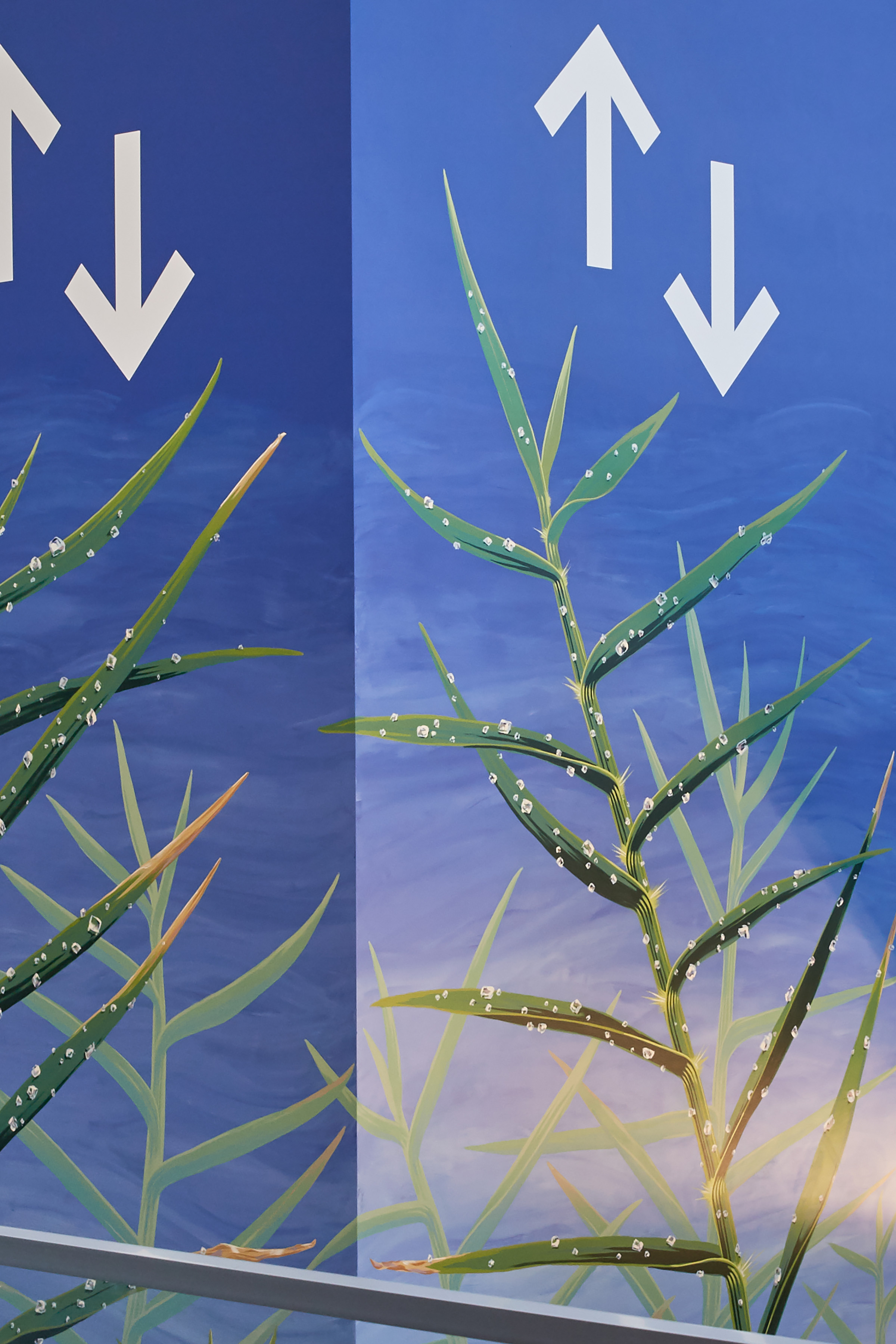
Laurel Picklum. Photos via Margaret Austin Photography.

Laurel Picklum. Photos via Margaret Austin Photography.

An early sketch of Laurel's mural.
Mural title: “Natural Attraction”
Artist: Amandalynn
Theme: Grasslands
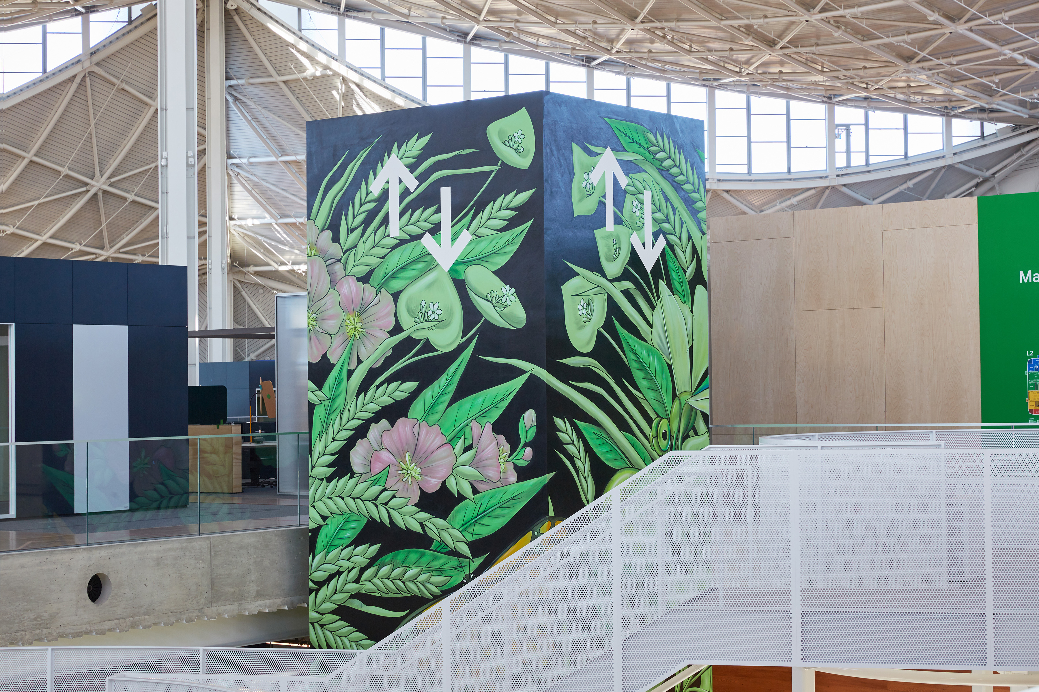
In the center of the building, you’ll spot Amandalynn’s mural. She typically works on projects of this size, though there were some unique aspects to this particular mural. “The challenge for me was more the fact that it was indoor with a lot more rules around movement and timing,” she says. The Grasslands' theme was perfect for Amandalynn, who says she enjoys incorporating the local ecology into her work. “I also almost always try to paint on a bright green background, so when I was asked to paint the Grasslands area with the theme color of green, the design came quickly.” It took Amandalynn about five days to paint her mural; she began with a charcoal outline of her piece then used all water-based acrylic paints in thin washes. “I’ve found this technique creates a nice sense of fine art within my murals and it uses less material, which lessens the environmental impact of the final product.”
Amandalynn. Photos via Margaret Austin Photography.

Amandalynn. Photos via Margaret Austin Photography.

An early sketch of Amandalynn's mural.
Mural title: “Mothership Mountain and the Many Moons”
Artist: Victoria Wagner
Theme: Scrubs
On to elevator number seven, featuring Victoria Wagner’s work. Victoria was inspired by the rolling lavender fields of California and other native plants, like yellow yarrow and tumbleweed. “Growing up in the high desert at the foot of the Sierras, it wasn’t a stretch for me to envision the mountains, blooming yellow sage flowers and the sharp light of my youth in that high elevation landscape.”
She uses that idea of elevation in her work. “You cannot help but look up at Bay View! The gift of looking skyward, pausing and allowing your posture to draw up and your chest to fill with air, is a subtle invitation to be at one with the vibration of land, sea and heavens,” Victoria says. “My hope is that the murals invite this kind of engagement and reverie.”

Victoria Wagner. Photos via Margaret Austin Photography.

Victoria Wagner. Photos via Margaret Austin Photography.

An early sketch of Victoria's mural.
Mural title: “Clouds on Earth”
Artist: Mariangela Le Thanh
Theme: Scrubs
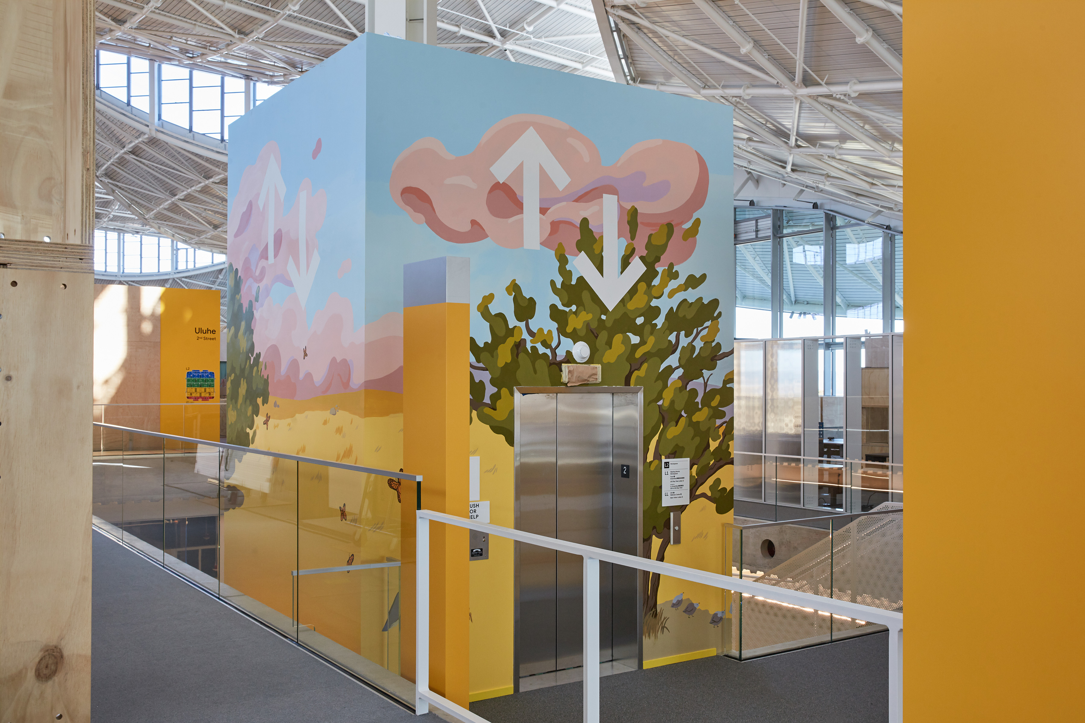
The next mural belongs to Mariangela Le Thanh. “I’ve painted some murals in the past but I’ve never worked on anything this large before — most of my paintings are around 10-by-10 inches,” Mariangela says. She said this bigger scale required more planning, and was a learning experience. She took inspiration from her home to create the mural. “I really wanted to paint the landscape that surrounds my home in Northern California. Since the image wraps around itself, I was inspired to paint lives immersed in cycles of clouds and flowers,” Mariangela says. “I hope people are reminded of a nice summer afternoon from their childhood when they look at my mural.”
Mariangela le Thanh. Photos via Margaret Austin Photography.
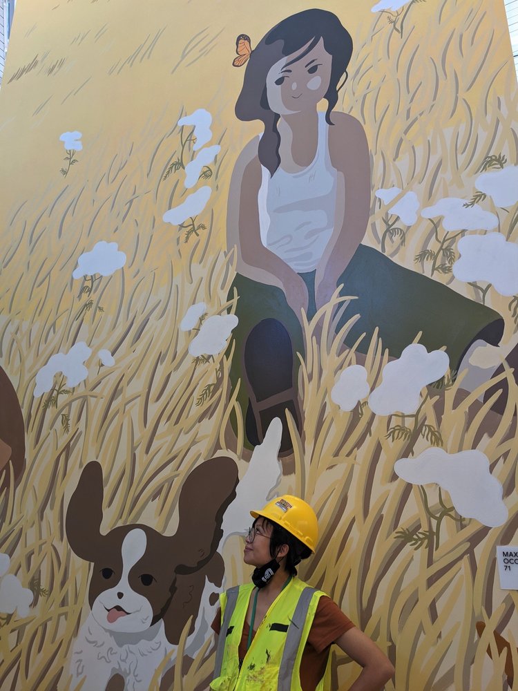
Mariangela le Thanh standing in front of her mural.

An early sketch of Mariangela's mural.
Mural title: “Love Story of Hummingbirds and Ancestors”
Artist: Adrian Arias
Theme: Scrubs
And mural number nine is by Adrian Arias. He was inspired by a hummingbird that visited his window one day and, surprisingly, settled for a moment. “My connection with hummingbirds is ancestral; it is part of my culture,” Adrian says. “Hummingbirds are sacred messengers between life and death, between what must be transformed to stay alive.” Adrian completed his mural in about four days, and he enjoyed it when construction workers who were working on the building would ask him questions or talk to him while he was painting.

Adrian Arias. Photos via Margaret Austin Photography.

Adrian Arias. Photos via Margaret Austin Photography.

An early sketch of Adrian's mural.
Like many of the artists, Adrian hopes that his mural leaves visitors with a sense of wonder. “I hope they have the feeling of wanting to know more about the images they see.”
