An inside look at 4 design details in our new Pixel devices

The design life of a product often involves balancing aesthetic consistency with the surprising and new. A product that people love needs to feel familiar and evolve at the same time. “Design is about working in constraints,” says Ivy Ross, Google’s Hardware Design and research VP. “It can be helpful to have a finite amount of what we can do, but that’s also what makes it challenging.” Ivy, along with Google’s director of Industrial Design Claude Zellweger and Wearables Design and Colors, Material and Finish VP Isabelle Olsson, took this idea to heart when designing the new family of Pixel products, including the Pixel 8 Pro, Pixel 8, Google Pixel Watch 2 and new Pixel Buds Pro.
“There’s a lot of work that goes into seemingly small things that ultimately make a product feel fresher,” Claude says. We spoke with the three design leads to learn more about the details of that work and what went into designing the latest additions to the Pixel lineup.
A hopeful color
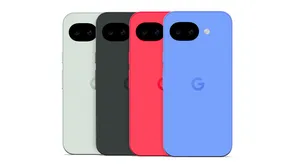
Part of the design for the Pixel 8 and Pixel 8 Pro includes the introduction of a new, blue shade called Bay, a striking hue that Isabelle says came from developing the color strategy during the pandemic. “Early on, we had this hope that when these products actually launched we would be coming out of the pandemic. Bay was inspired by this idea of looking at the sky at noon on a sunny day,” she says. “What’s more hopeful than looking up at the sky on a sunny day?” What’s also distinct about Bay is that it appears across the entire Pixel family: You can get the Pixel 8 Pro, the Pixel Buds Pro and a Google Pixel Watch band all in the bright blue shade. “It’s the first time we’ve really seen a color coordinated for all the new devices that way,” says Ivy. “And it’s just a happy, uplifting color.”
When the new colors were being tested internally with Googlers, Isabelle noticed how much people were gravitating to Bay. “The most fun part of the process is when we start seeing people react to what we’re doing,” she says. “We didn’t know how people were going to react to the blue, but we started hearing ‘Hey, can I get the blue band? Can I get the blue Pixel Buds? And the blue phone?’ A lot of testers were trying to create their own little family of blue Pixel devices.”
A design mockup of the blue Google Pixel Watch band.

Refined camera bar and sustainable build
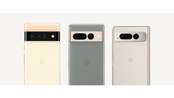
We introduced the Pixel camera bar in 2021, and it’s quickly become a trademark of the Pixel family. And with the Pixel 8 and 8 Pro, it’s evolved. “We built on the signature design by bringing more focus, purpose and protection to our camera system,” says Claude. With the Pixel 8 Pro, the rear camera array now sits within a single, pill-shaped enclosure on the camera bar. Both the Pixel 8 and Pixel 8 Pro feature contrasting glass and metal finishes which help to visually highlight the camera.

“We wanted to focus on the idea that the camera is a VIP element of the Pixel,” Claude says.
You can see other areas where Pixel’s build has progressed — notably when it comes to sustainability. Both Pixel 8 and 8 Pro are made with recycled aluminum, glass and plastic. “We first introduced 100% recycled aluminum 1 on Pixel 5’s back housing enclosure and we’ve been working to scale it across our portfolio ever since,” Isabelle says. Plus, Pixel 8 and 8 Pro are more easily repairable. “For example, we added graphic elements to the inside of the phones to guide users through the steps of replacing the battery,” Claude mentions. And the teams worked hard to make sure more of the materials that come along with the new Pixel phones (including their plastic-free packaging) are recyclable.
Back to the matte back
Developing a new device always requires navigating multiple factors, like time, supply chain logistics, engineering needs and technical specifications — all of which play a role in the final design. "Sometimes, we have to put ideas on the shelf and then revisit them later when everything aligns," Isabelle says. That's the case with the matte glass back, which was featured on the Pixel 4. And now, with the Pixel 8 Pro, the matte back is back. The designers are happy to see it return — the matte back gives the devices a subtle grip and silky feel and is great at preventing fingerprints.
Smoother all around
You might notice that the Pixel 8 and 8 Pro are less boxy than their predecessors, with thinner bezels to reveal more of the glass display. “With help of our engineering partners, we've been able to improve the fit and finish to complement the phones’ smoother surfaces,” Claude says. “The first time I picked up the device with a working screen, I was struck by the impact of the new, bigger display, the larger corners and thinner edges.”
Holding the Pixel 8 and Pixel 8 Pro is even more comfortable, thanks to a softer silhouette and smoother edges.

This change is part of the industrial design team’s continued effort to create approachable products that people feel comfortable using — it’s important, they say, to make sure there isn’t anything intimidating about Pixel. “With something that you’re constantly holding, wearing or putting up to your ear, it’s critical to be comfortable visually and physically.” Curves are something of a more inviting shape, Ivy says.
“There’s a subconscious undertone there that we might not even realize we respond to with a curved surface,” she explains. Plus, that softness plays up the harder edges that do exist. “Look at the camera bar — it’s very precise, and yes, it has some sharp angles,” says Claude. “But it’s that contrast that makes for compelling design that draws the eye in.”
As we continue to advance the capabilities of Pixel products, the designers have to make sure that the look and feel follows that development and inventiveness too. But, Claude says, they enjoy rising to the occasion. “That challenge is at the heart of our creativity,” he says. “There’s immense excitement around thinking, ‘What’s next?’”

